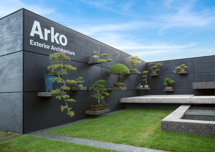
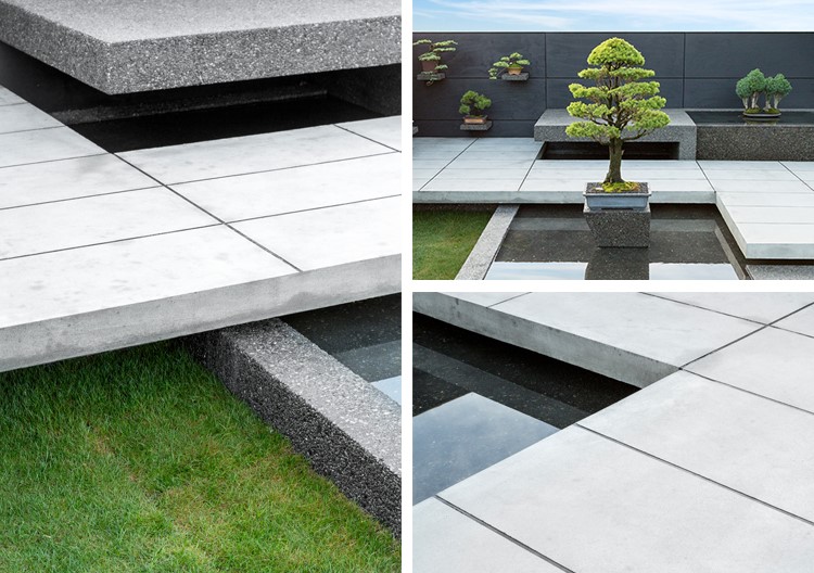
When Jay van Lent took over his parents' concrete company, he had big ideas. Under his guidance, the company was evolving to include landscape architecture, construction and longer-lasting concrete mixes. To reflect this, he needed a new identity.
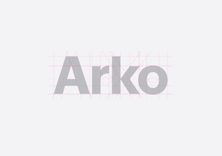
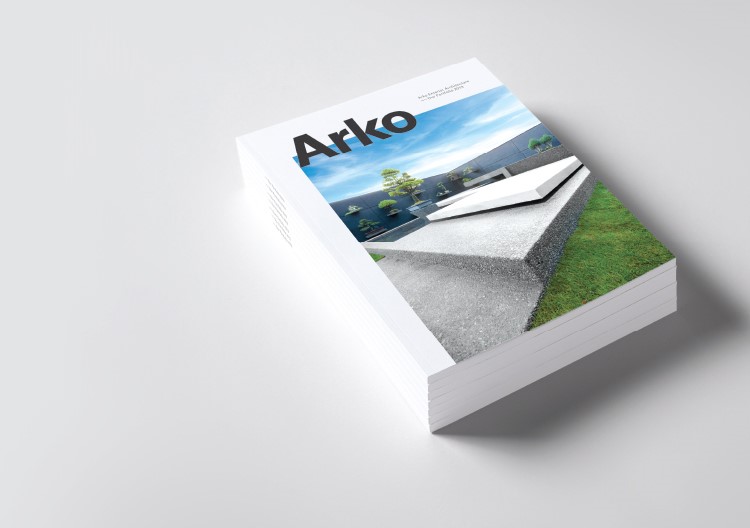
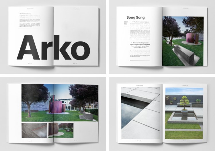
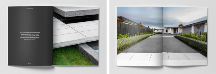
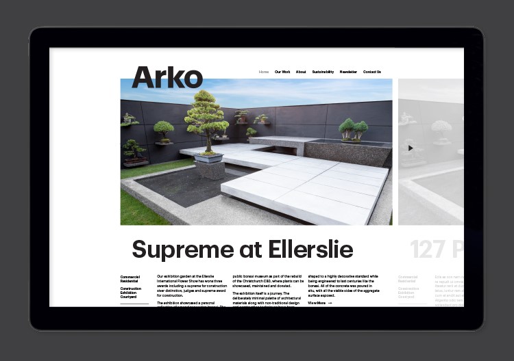
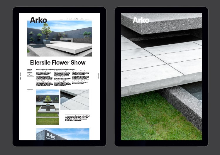
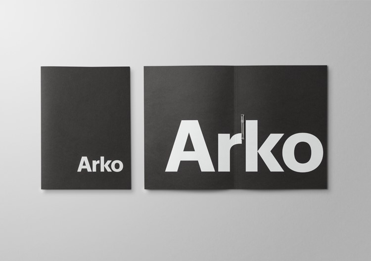
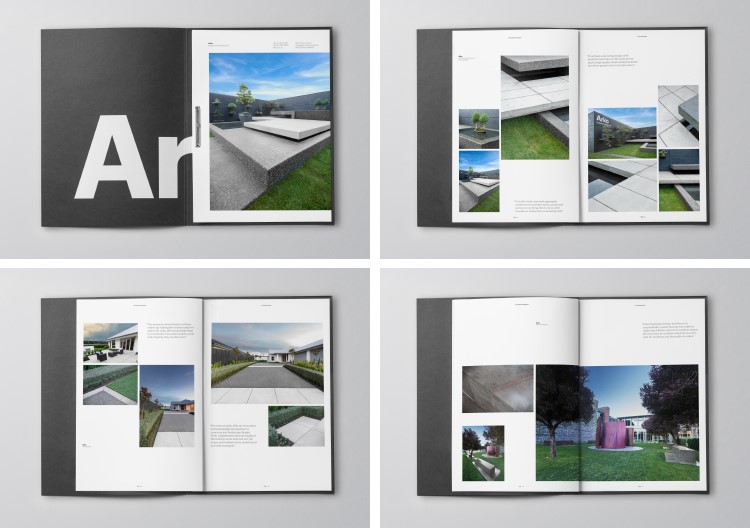
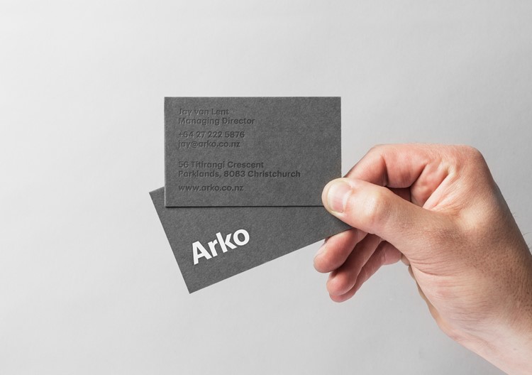
First, we changed the name from Amazing Concrete Generation to Arko, with the positioning statement Exterior Architecture. Then we developed a brand that reflected the new ethos of the company. We paired a rock-solid geometric identity with a hyper-real photography style. Contrasting inks and printing techniques on white, black and grey paper stocks reflect the textured detail and variation in Arko’s complex concrete work. With this distinct identity carved out, we created a printed portfolio and website, both of which now make up core marketing tools for Arko.