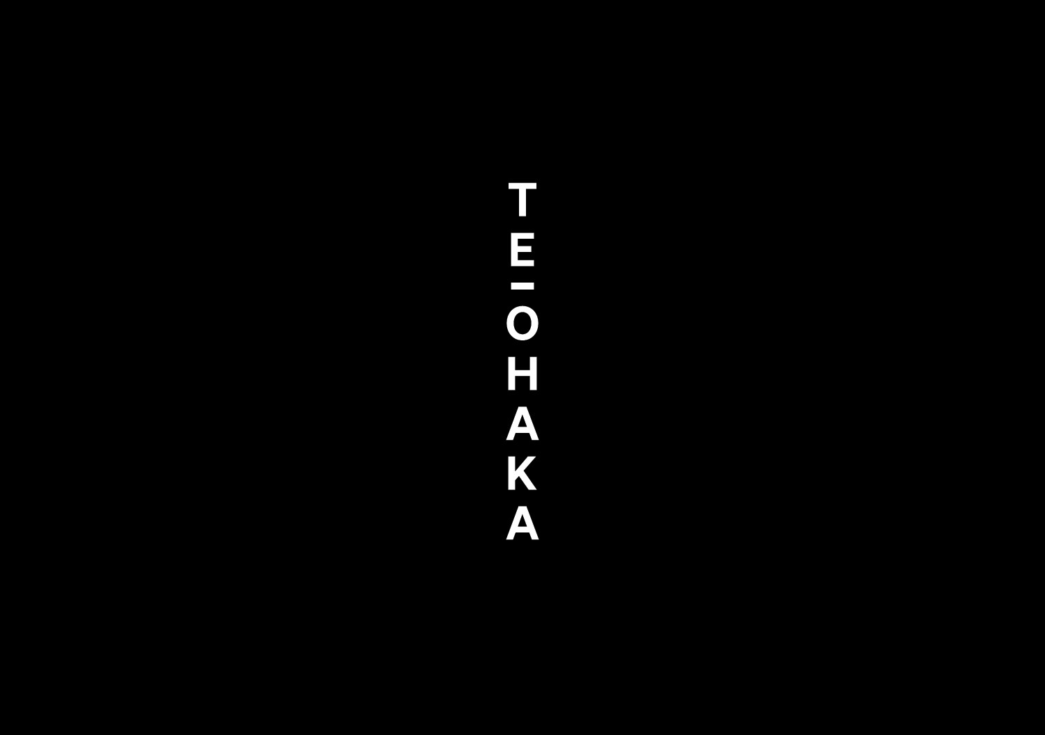
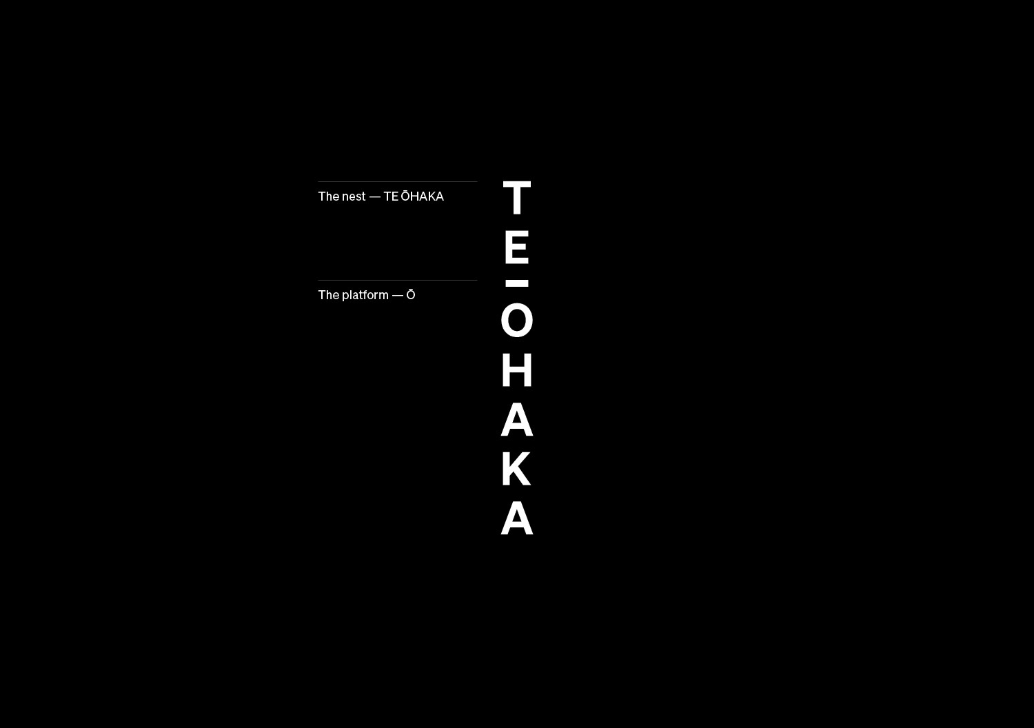
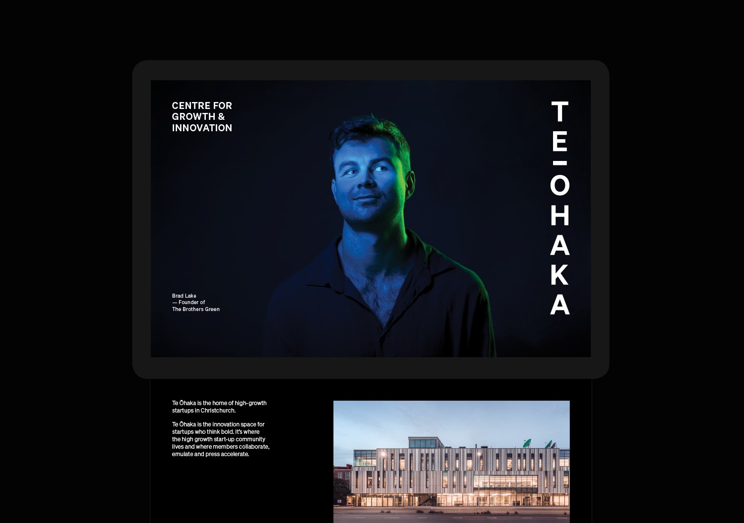
Te Ōhaka in its literal te reo meaning translates as ‘nest’. It also has a deeper, more symbolic meaning as an incubator, a home for only the most high flying birds. Making it the perfect name for a start-up hub for Christchurch’s most innovative businesses.
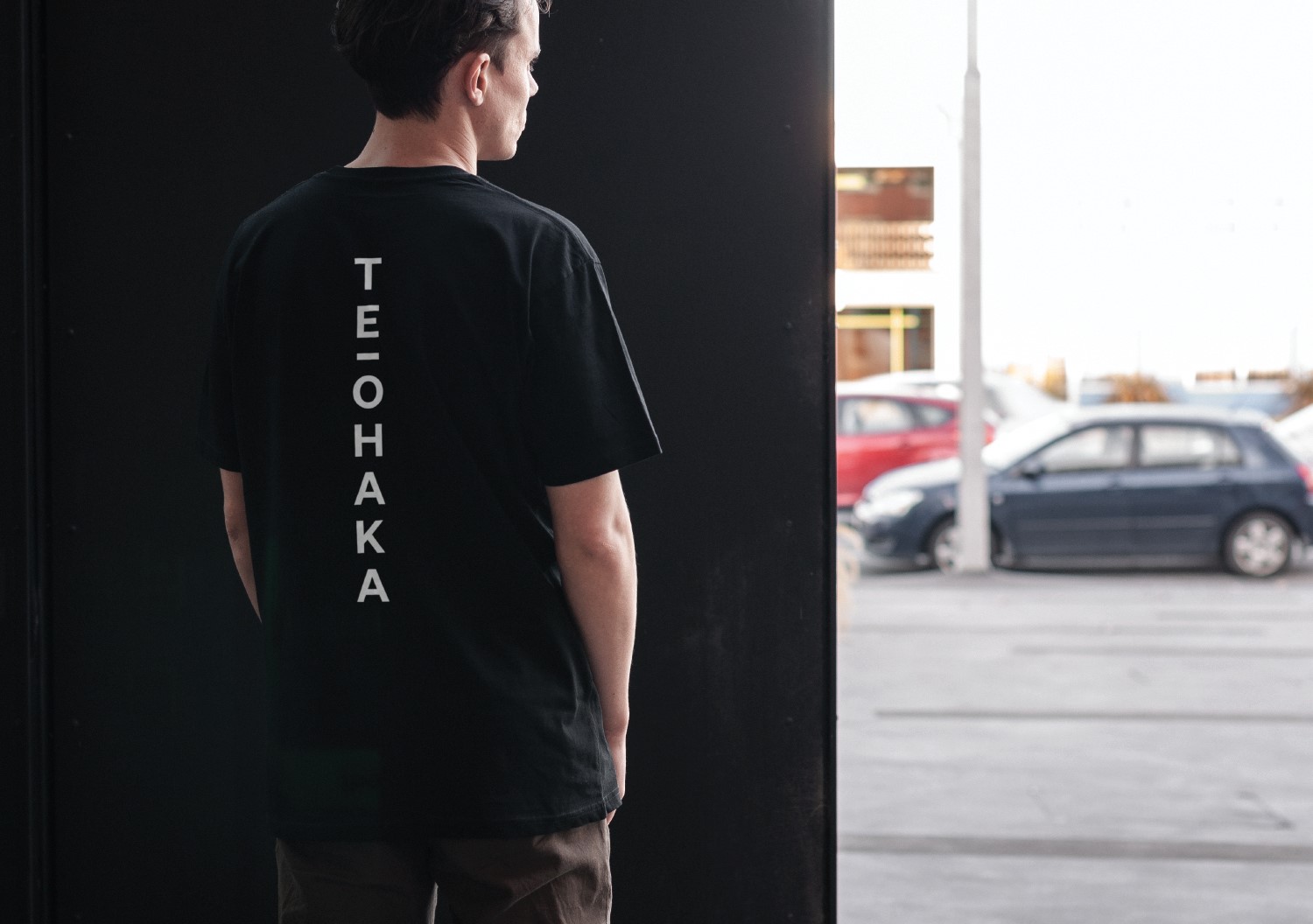
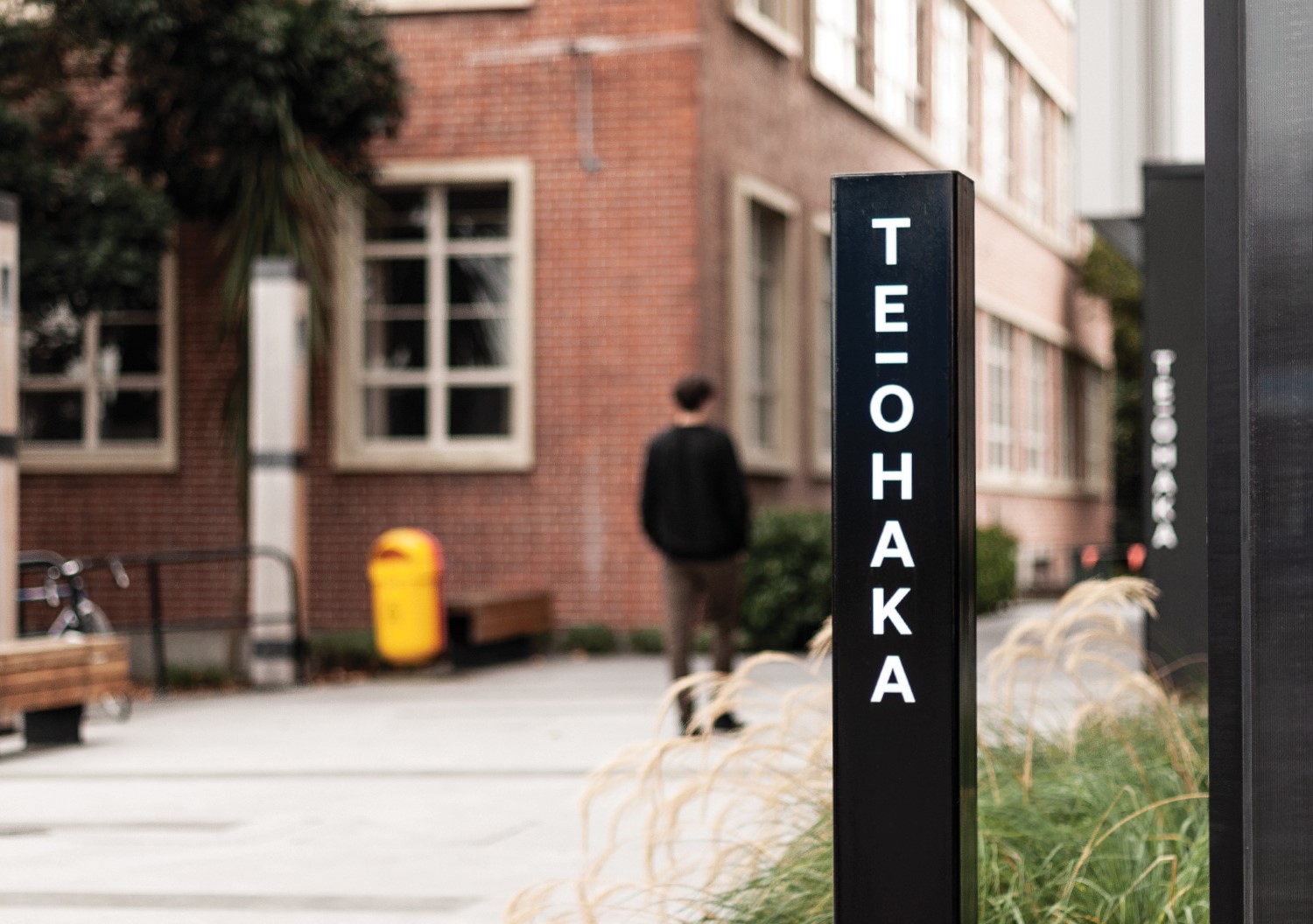
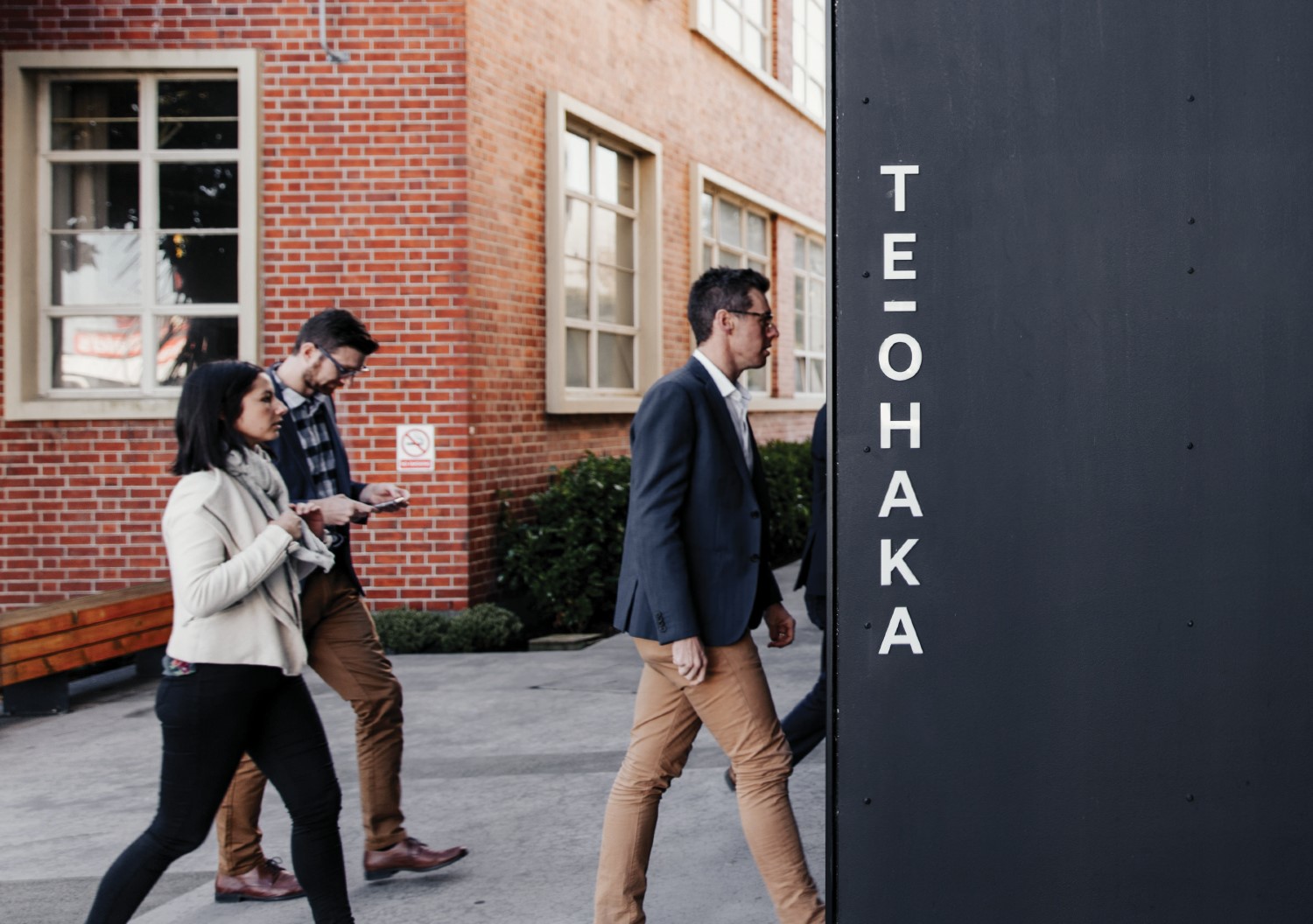
Te Ōhaka’s identity is based around ‘aiming higher’ and elevating business potential. The macron 'Ō' from the logo represents this concept of upholding something on a platform (opposite to Kiwi tall poppy syndrome) — a literal representation of this ‘perch’ from which highflying birds take flight. This became the foundation of the design language, further developed in the way the name is vertically stacked. By vertically stacking the words, each letter becomes a platform for the next, both looking up and providing a platform for the letter above.
In this way, ‘aiming higher’ is inherent in everything Te Ōhaka says and does.
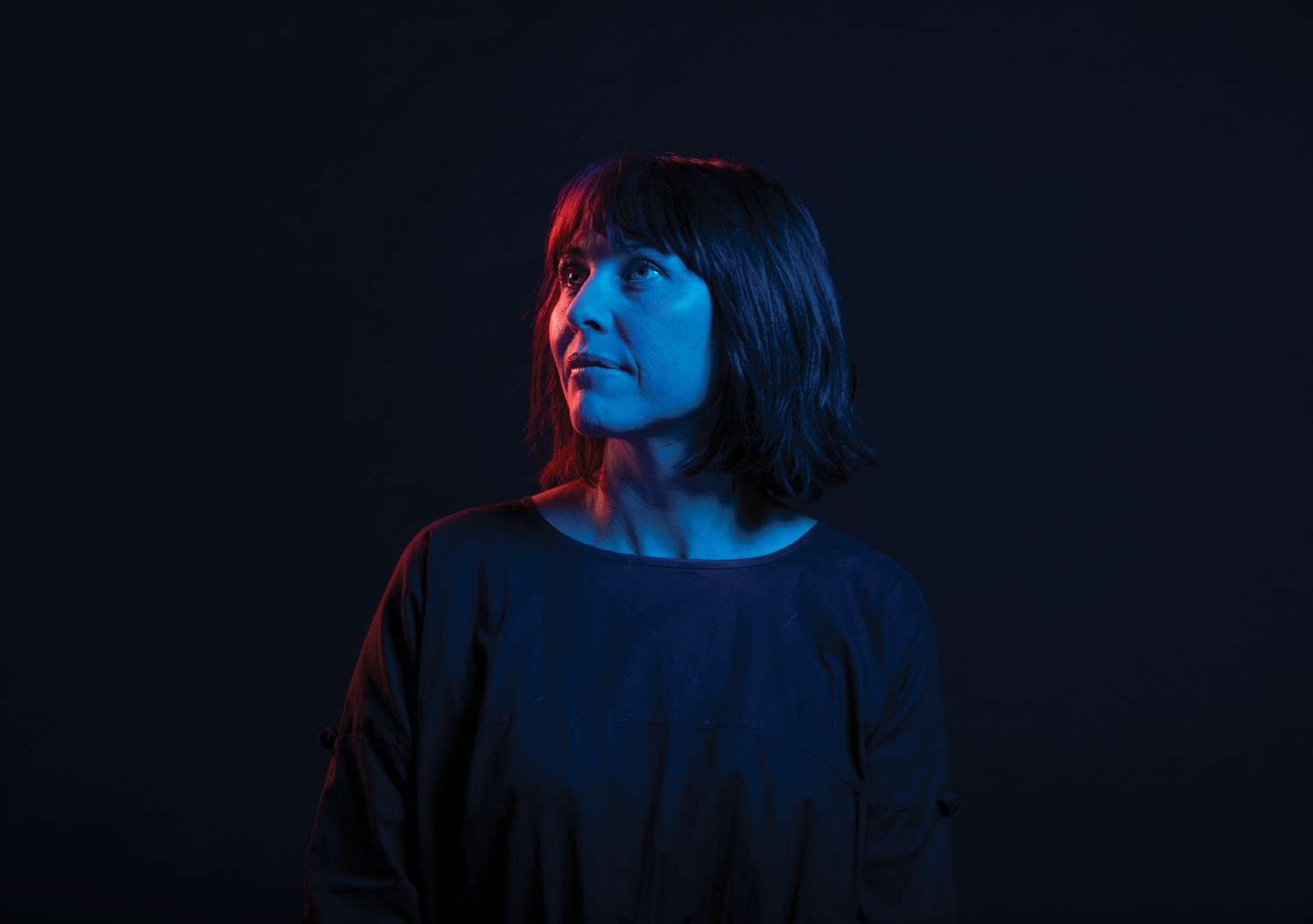
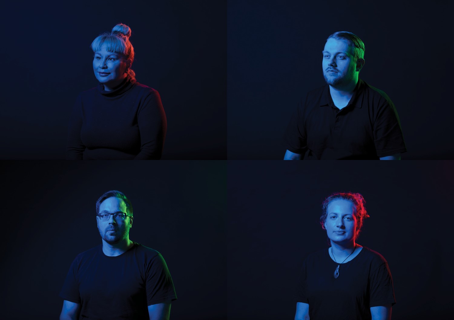
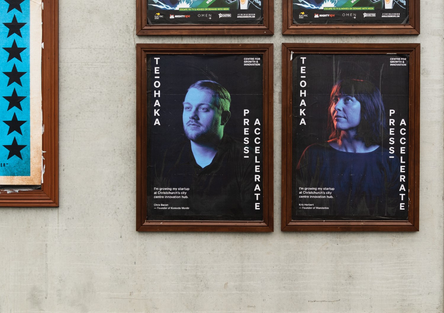
We then looked at how we could further explore not just the ethos of ‘aiming higher’ but celebrate their most tangible asset — the incredible talent it nurtures and incubates.
We chose a selection of Te Ōhaka’s most inspirational members, running a wide range of boundary pushing start-ups, from online market places to hemp food solutions. The intent of the portraits was to be celebratory and inspirational, with the models directed into playfully confident expressions. While the coloured gels represent the ephemeral qualities of the ‘idea’, they also serve as a reminder that the quest for bettering oneself — and by de facto your ideas — is never finished.
You form your ideas, but then are formed by them. The mirror of this is, in business, you are constantly striving for better — you’re business is never finished. Once again, reinforcing the Te Ōhaka’s identity’s principle concept of ‘aiming higher’.