Frasers Property are a large scale, environmentally aware property development firm specialising in the residential and commercial sector in Australia. With further developments under way, they saw an opportunity to offer a new service to their new tenants by way of supplying their energy needs with a cheaper, greener and simpler solution than the four major providers.
Strategy was brought in to help develop the brand from the ground up. Starting with some industry analysis, we quickly moved through to a naming exercise, and with Frasers brand values in mind and their desire to be seen as a down to earth, community focused brand, Real Utilities was born.
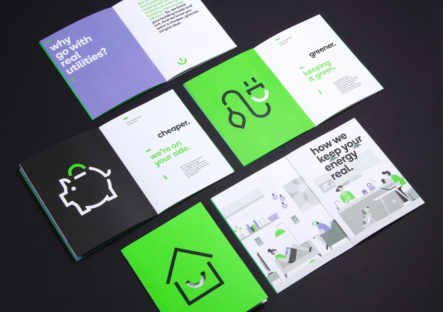
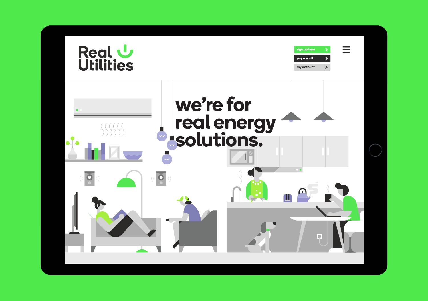
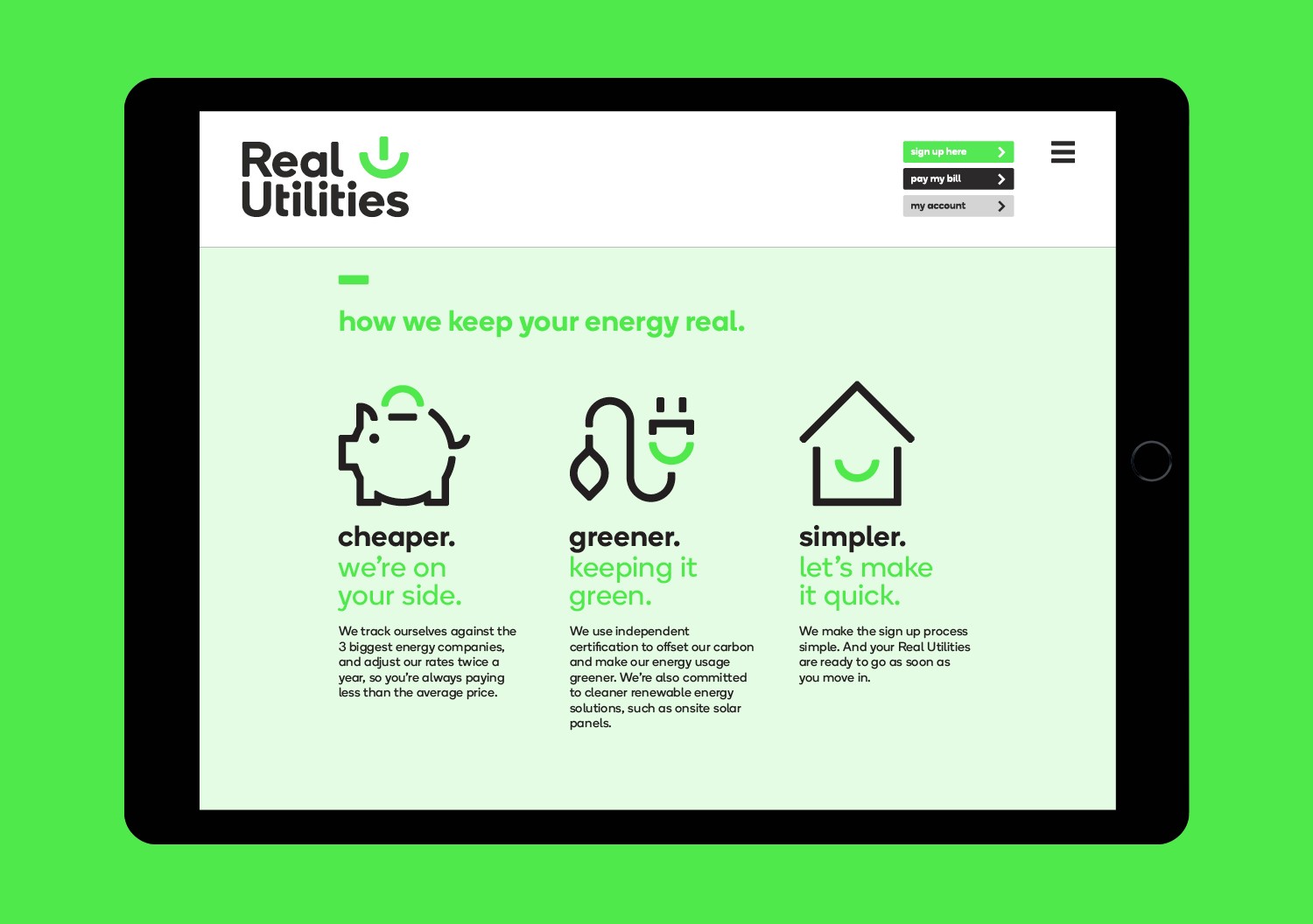
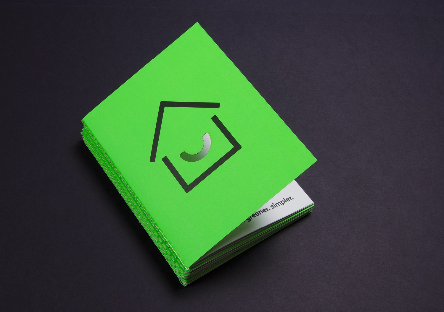
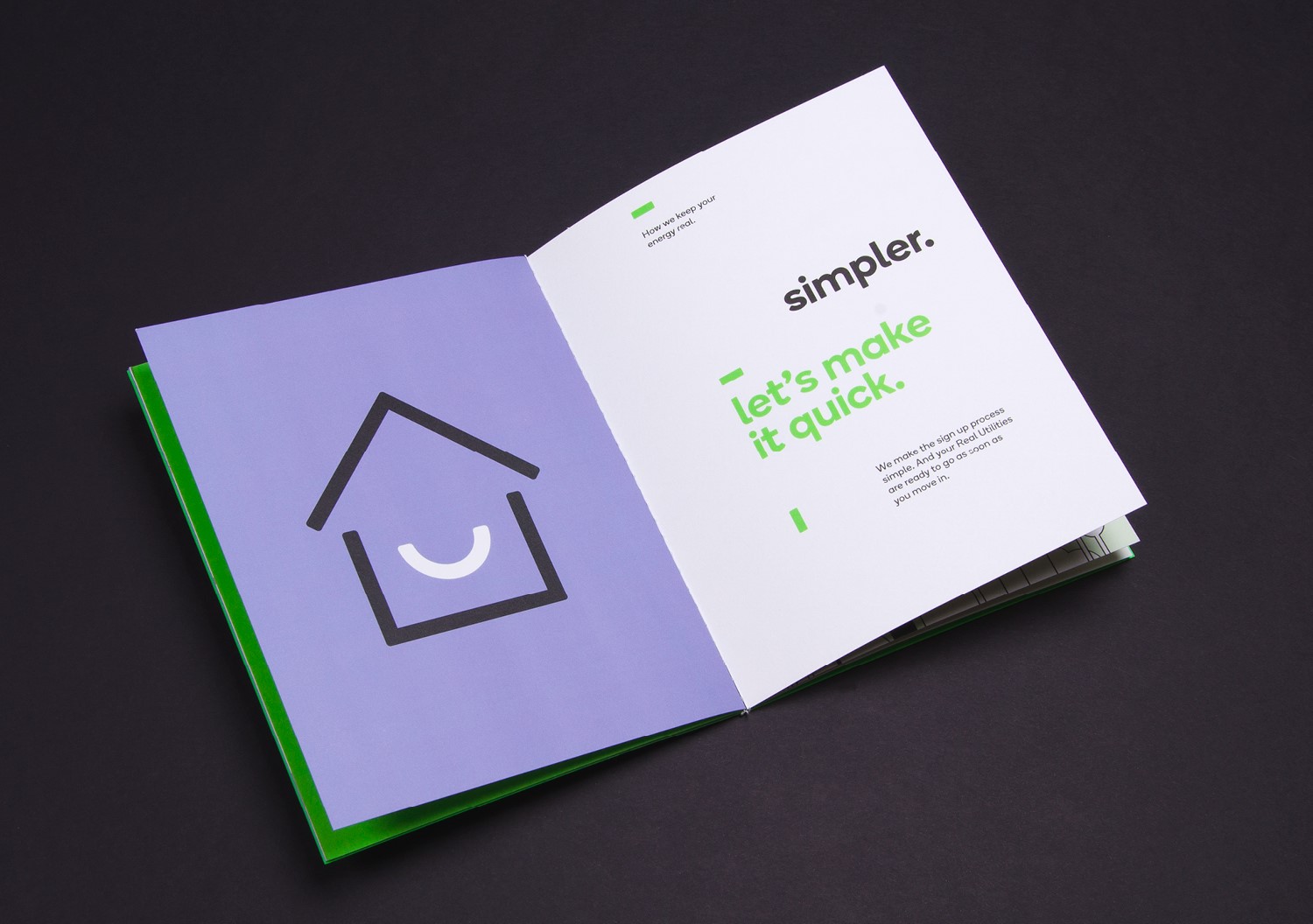
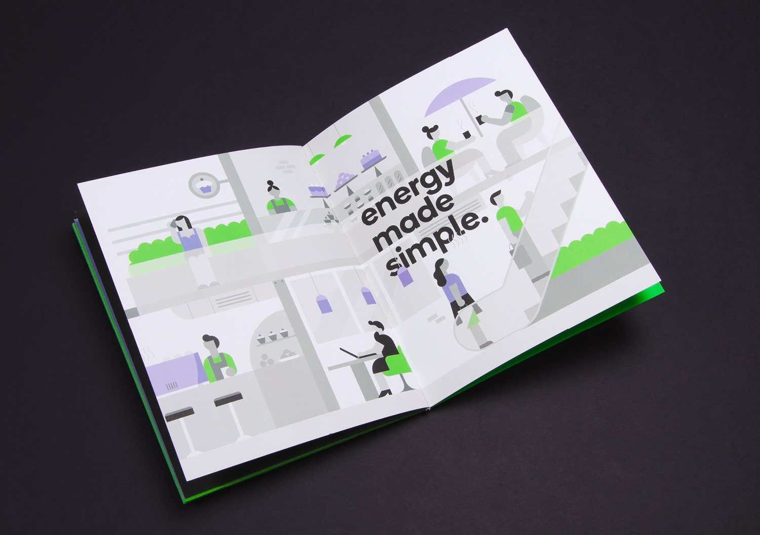
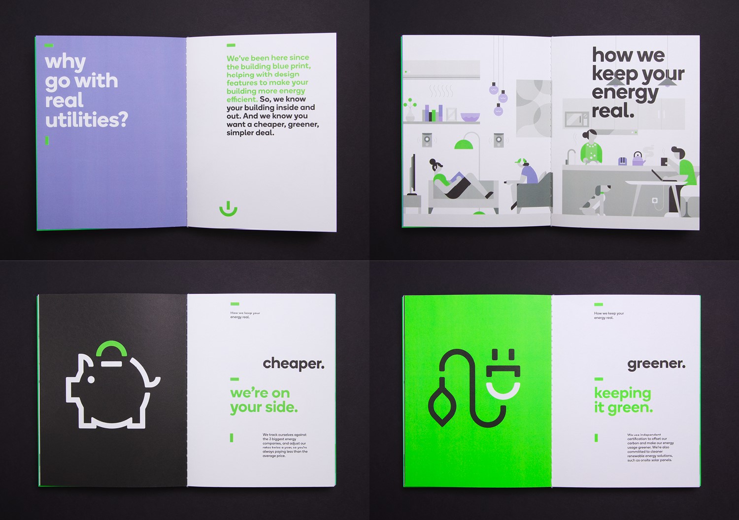
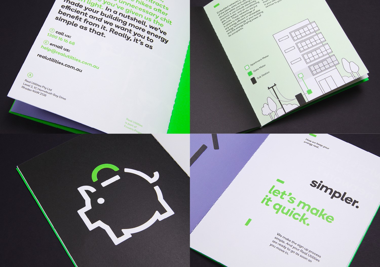
Having developed a consumer friendly logo inspired by the ‘on’ and smile symbols, we then commissioned a series of contemporary illustrations from The Makers Company that helped convey the personality of the brand along with the consumer benefits, and developed a series of icons and a down to earth tone of voice to help keep things simple. With a range of sales tools and a web site that provides far more than just the brand story alone, Real Utilities are well equipped to offer their tenants the cheaper, greener and simpler solutions that we all crave from energy providers.