Dalman Architects is one of Christchurch’s most respected architecture firms and wanted to make the most of a studio relocation to undertake a full rebrand.
In the first instance, we worked closely with Richard Dalman and the team to understand the firm’s 20-year history: where it has come from and where it wants to be going. His instructions to us were to create a brand identity which is bold, stands out, and represents the many facets of Dalman’s work.
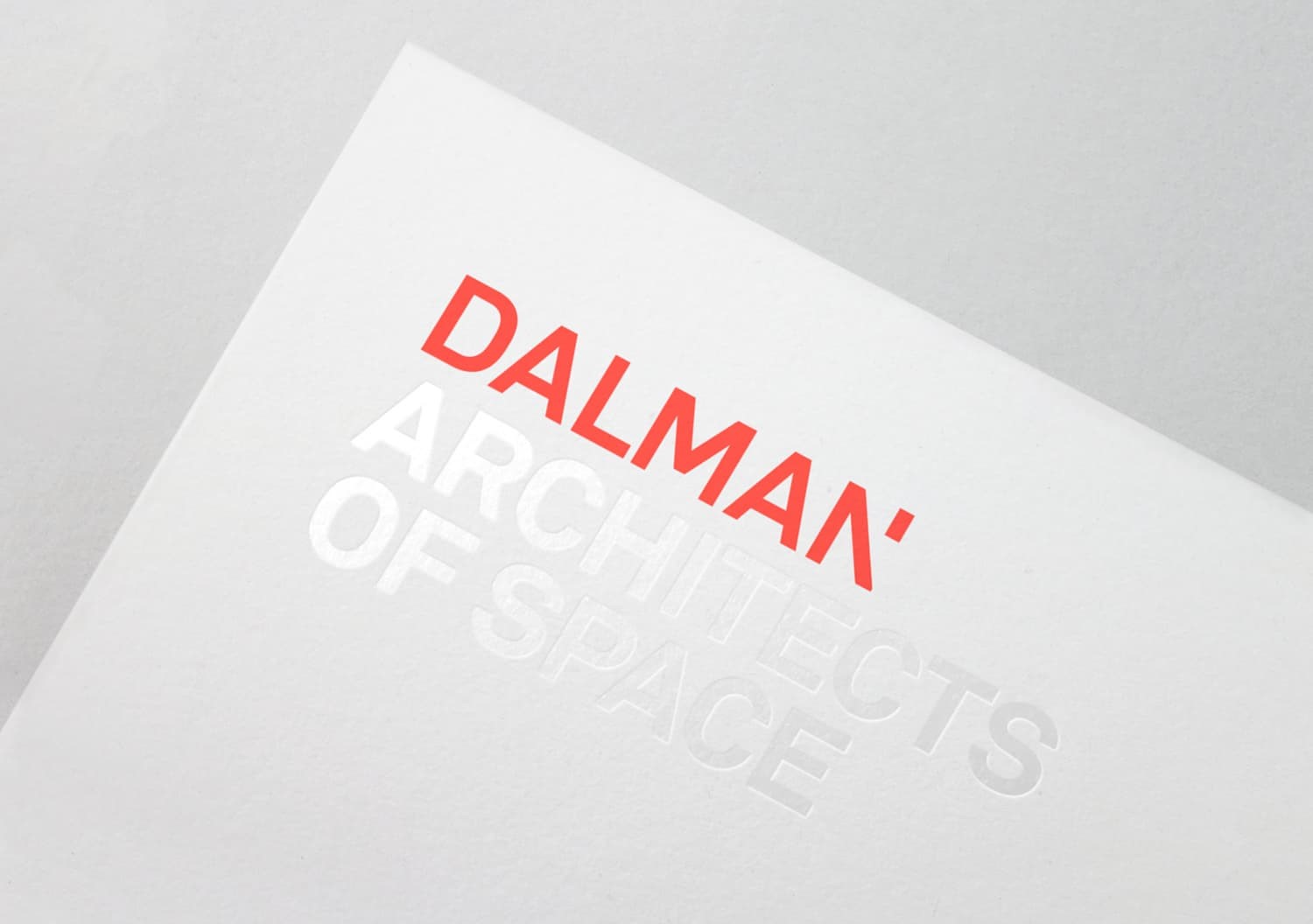
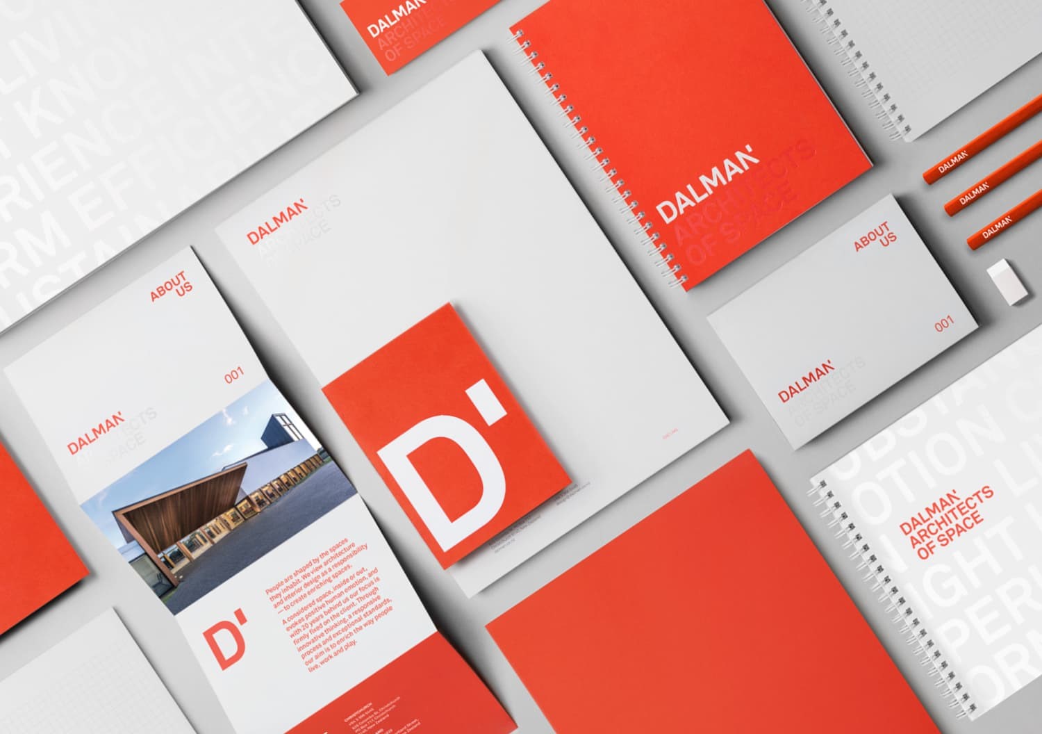
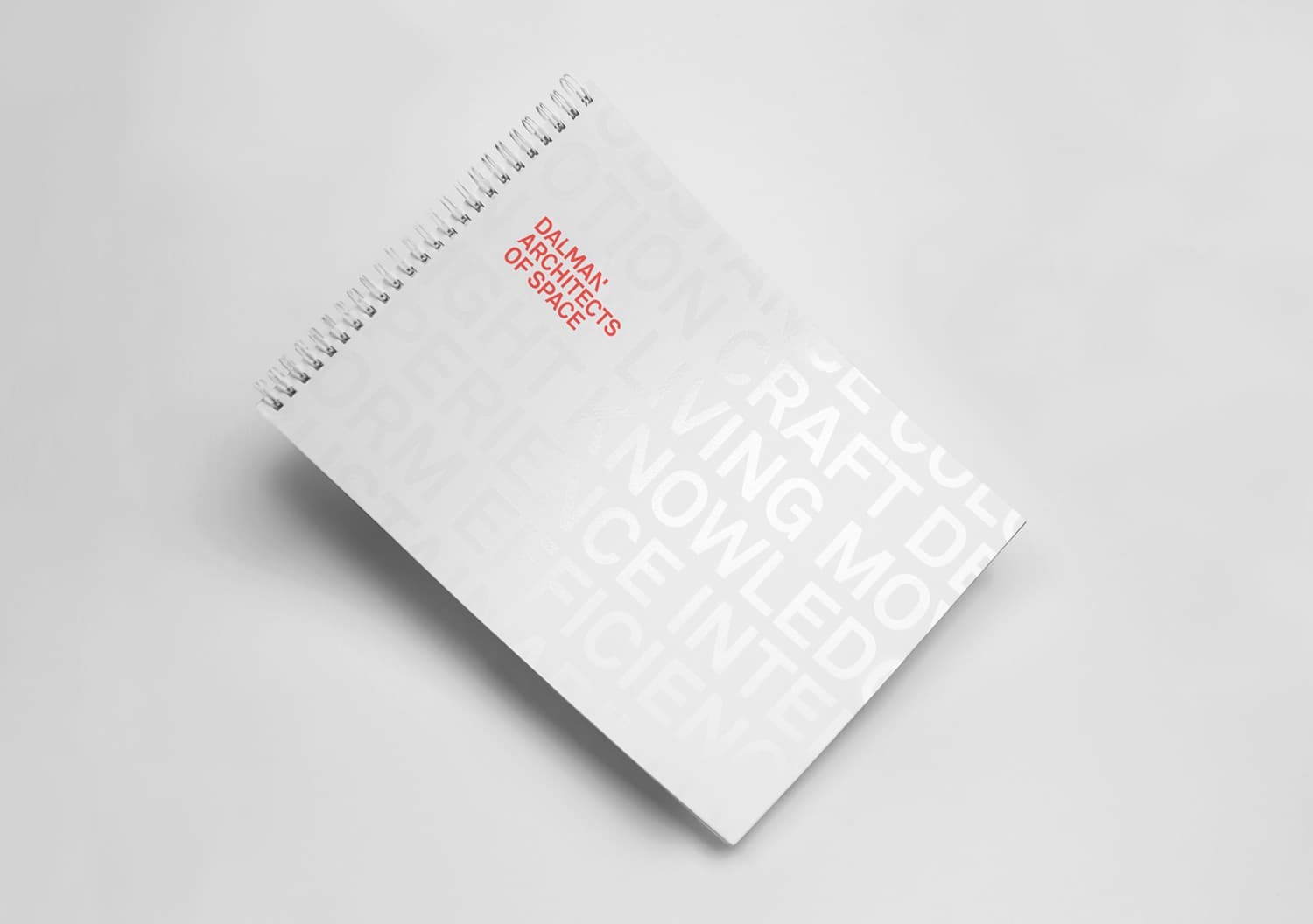
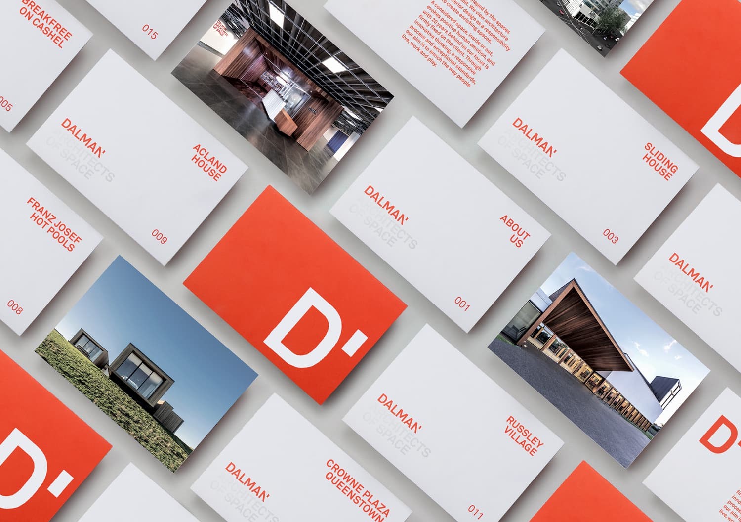
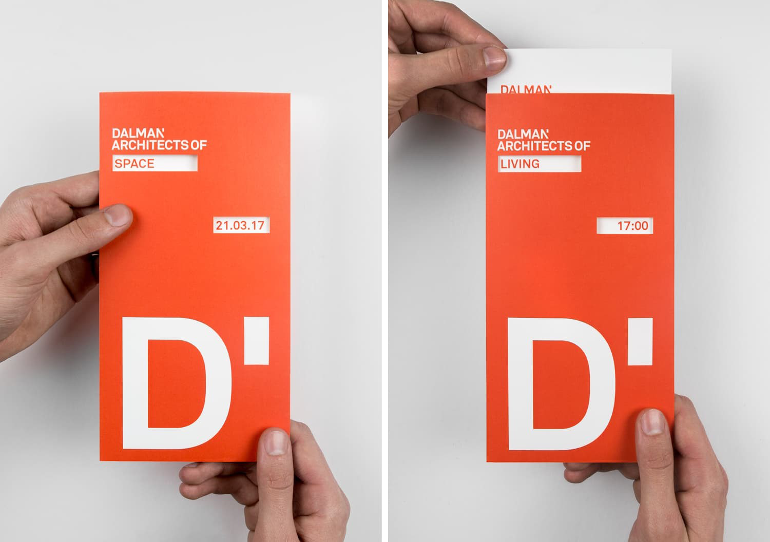
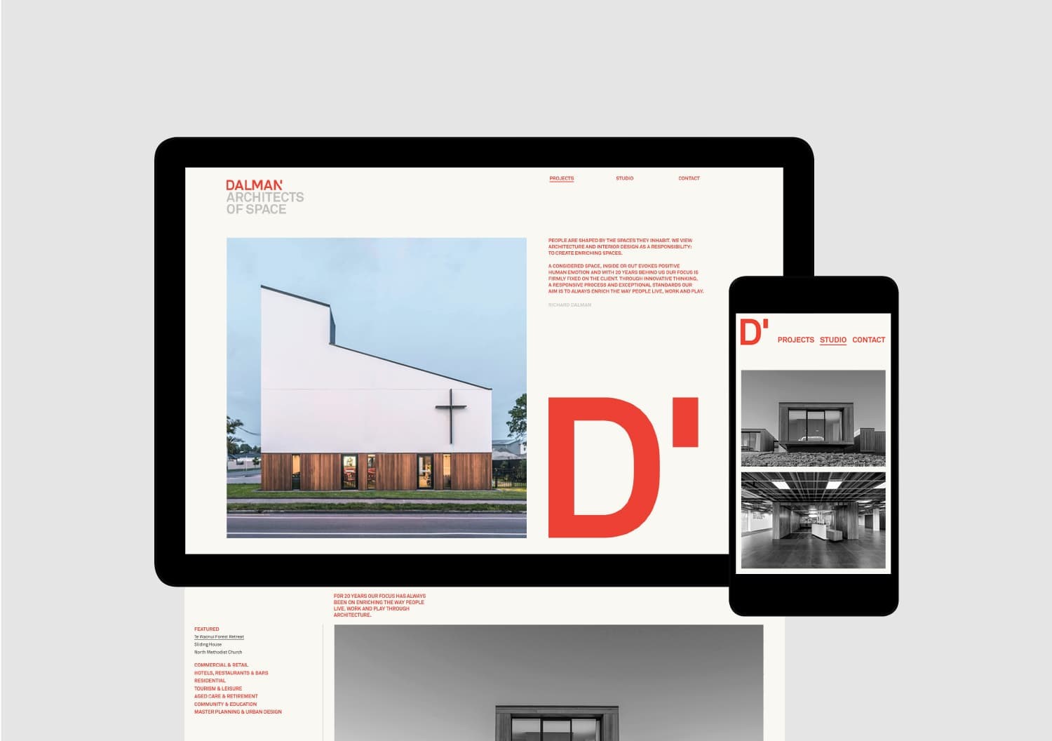
Dalman needed a bold colour it could own, so an intense Pantone red was chosen. To balance against the red, an extensive use of negative space was necessary. To communicate the varied work Dalman does, we created a variable language system that was used in the logo lockup.