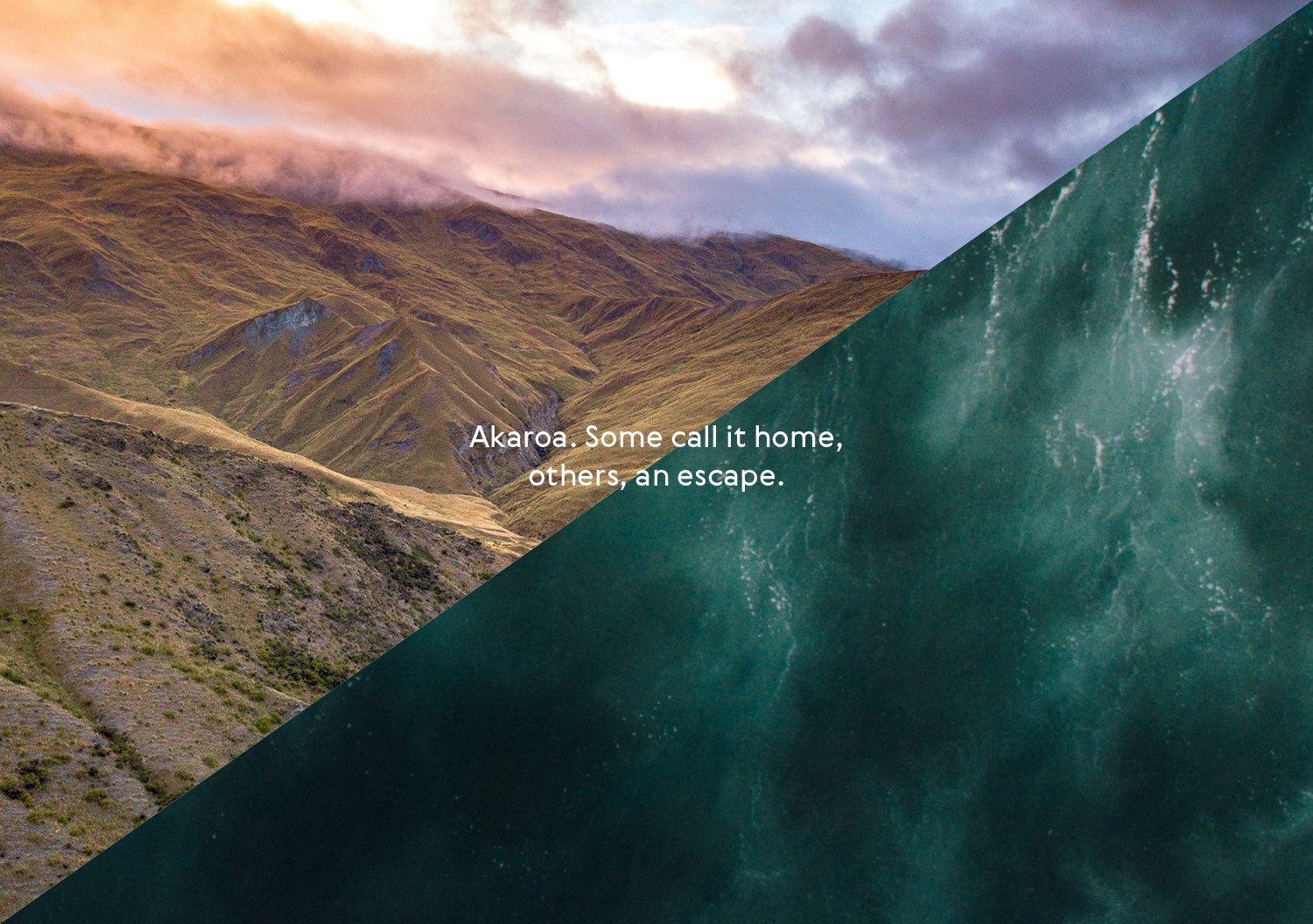
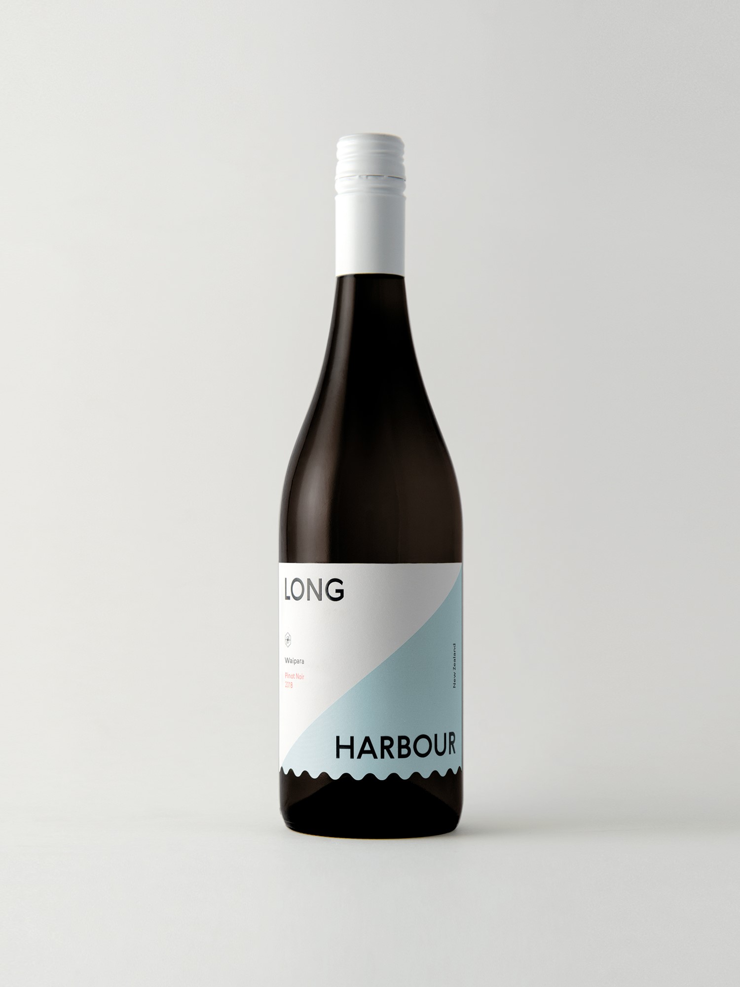
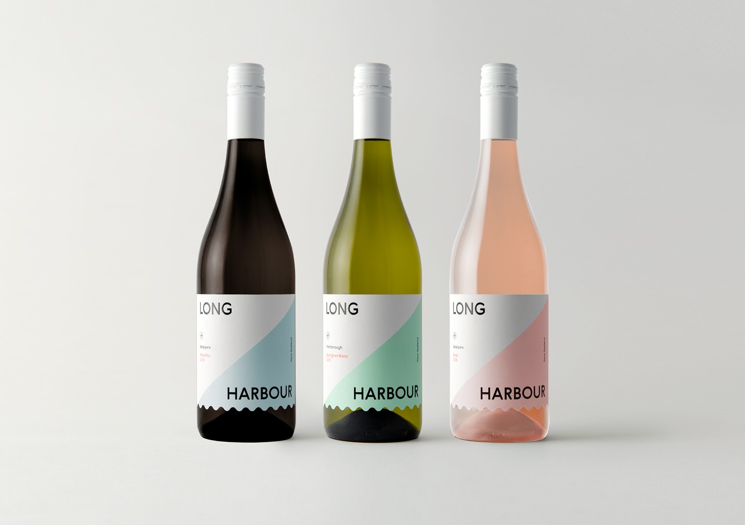
Lighthouse Wine Company approached Strategy Creative to help them introduce a new wine brand called ‘Long Harbour’. The name Long Harbour was in reference to Akaroa (where they are based), which roughly translates to 'long harbour' in Māori.
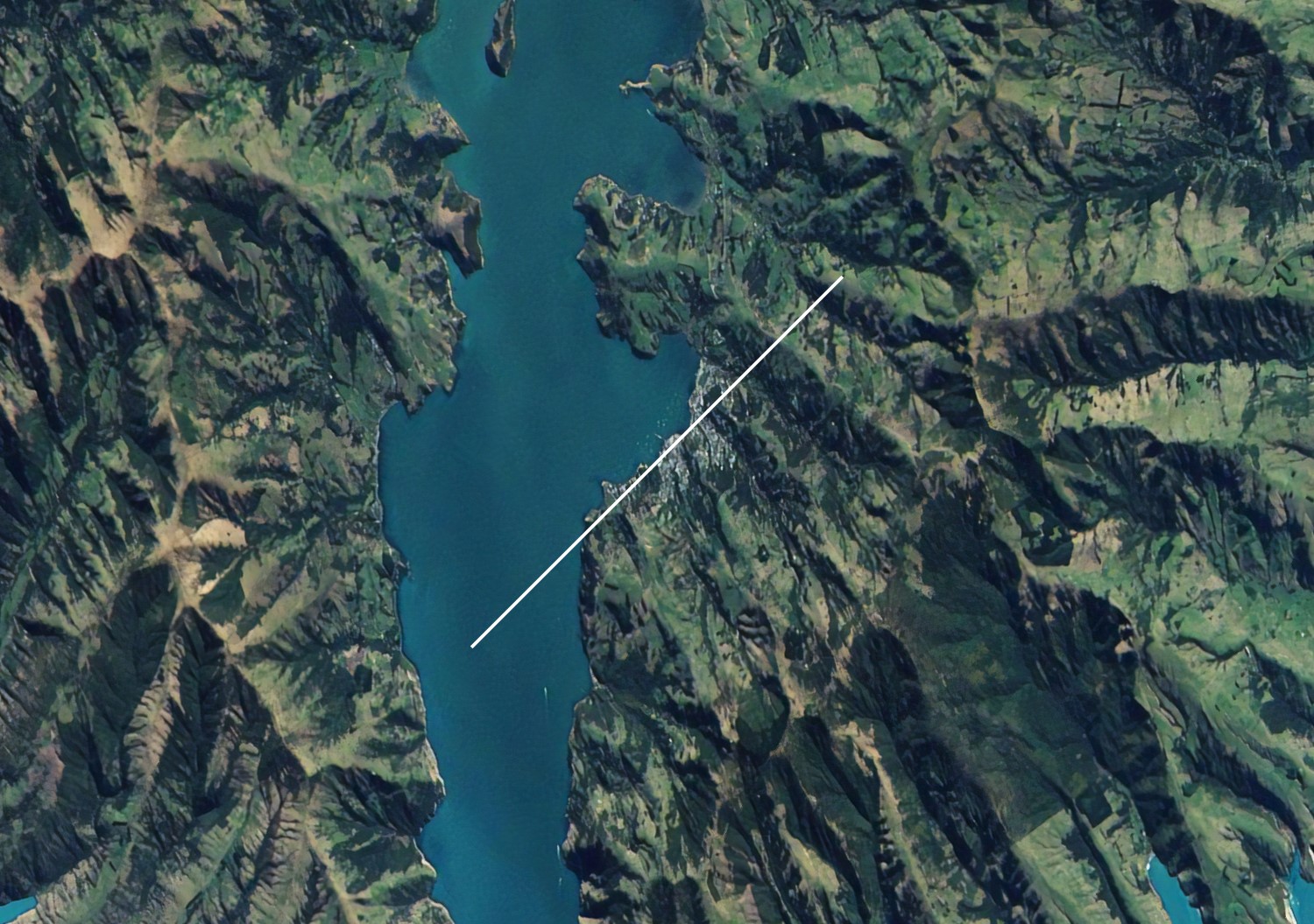
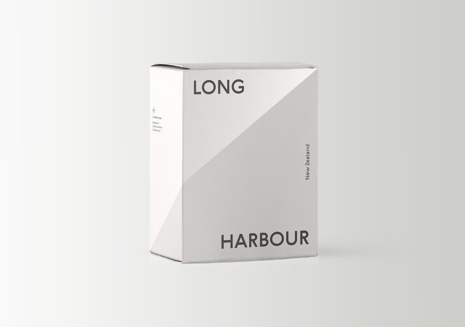
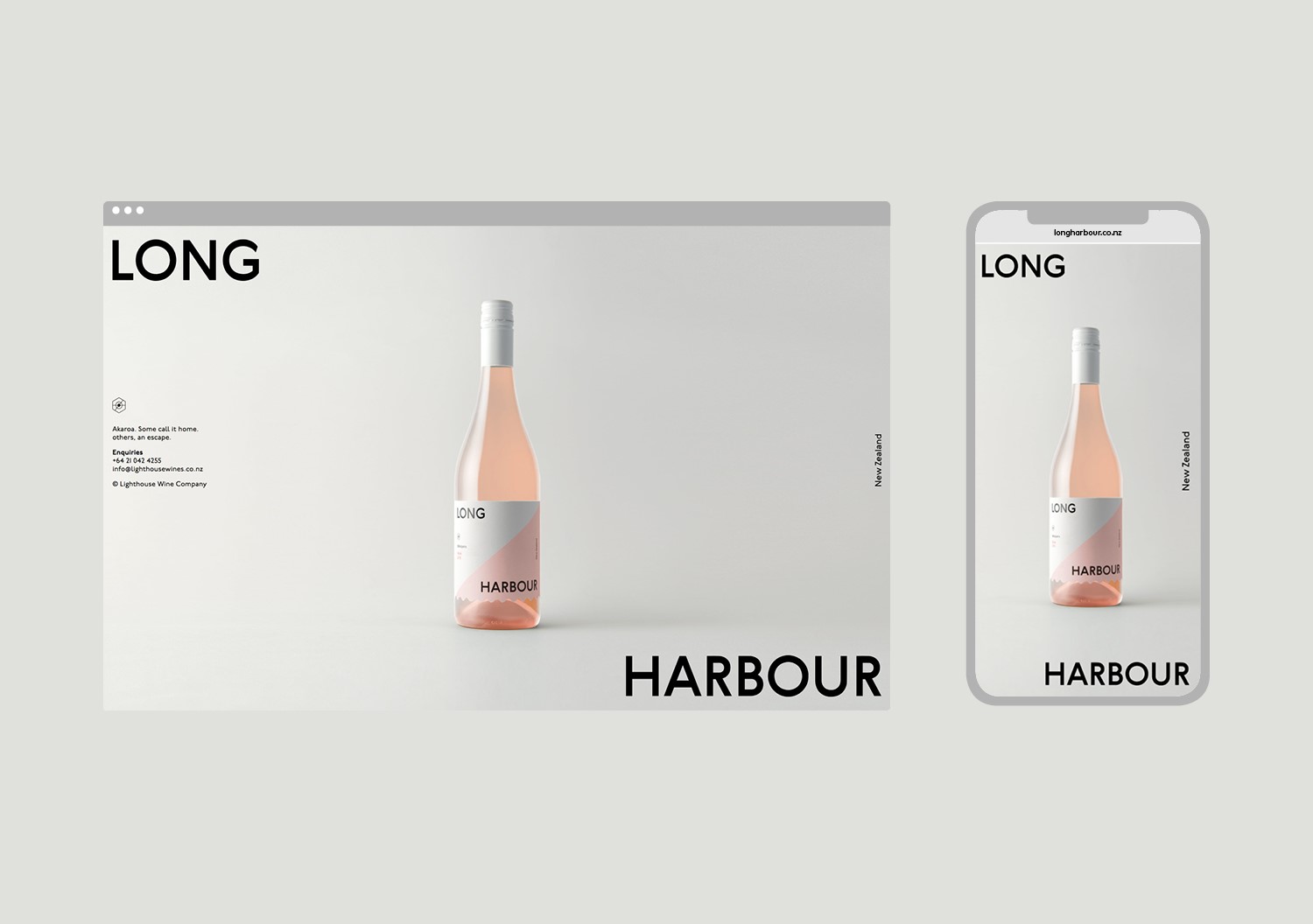
With the existing Lighthouse Wines logo being based on a birds-eye view of the Akaroa Lighthouse, for Long Harbour we decided to take a birds-eye view of Akaroa itself. We discovered that when viewed from above, the Akaroa harbour is on a near-perfect 45 degree angle. We took this distinct angle and—by taking visual cues from nautical flags—adapted it to create a strong graphic system for the brand. Splitting the brand name across the divide, the system was applied across all packaging and brand assets; including labels, boxes, and a simple web landing page.