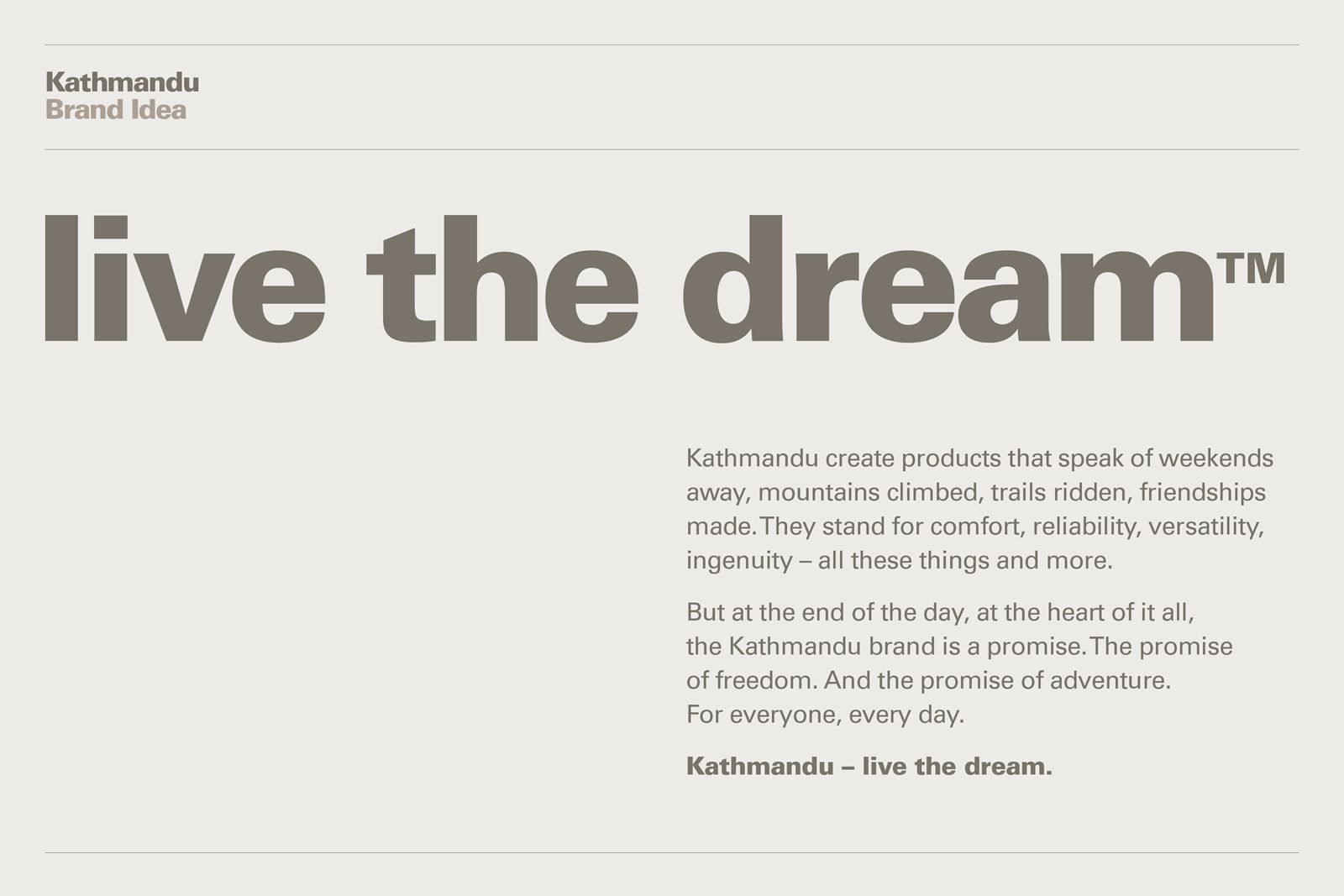
成功している小売ブランドでも、お客様に合わせて進化していく必要があります。Kathmandu社からの指示は、「ブランドに新しい顔を与え、事業全体を通じて統一でき、デザイン理念を反映し、『刺激的なアドベンチャー』の精神をとらえたロゴを」。
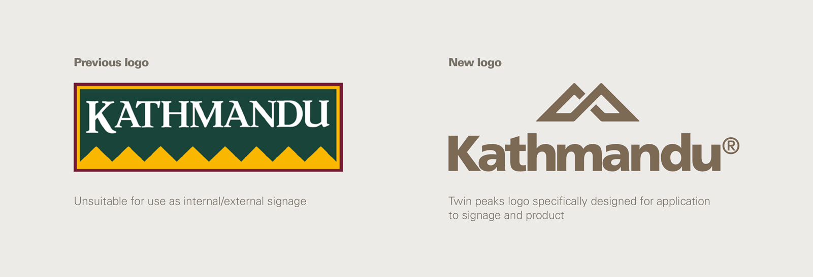
社の総売上高の95%がKathmanduブランドの製品であることから、製品にしっくりくるロゴを考案することが極めて重要でした。 余計なものをすべて排した新しいロゴを開発し、看板からファスナーのつまみまで、あらゆる場面にフィットするよう仕上げました。
成功している小売ブランドでも、お客様に合わせて進化していく必要があります。Kathmandu社からの指示は、「ブランドに新しい顔を与え、事業全体を通じて統一でき、デザイン理念を反映し、『刺激的なアドベンチャー』の精神をとらえたロゴを」。
社の総売上高の95%がKathmanduブランドの製品であることから、製品にしっくりくるロゴを考案することが極めて重要でした。 余計なものをすべて排した新しいロゴを開発し、看板からファスナーのつまみまで、あらゆる場面にフィットするよう仕上げました。
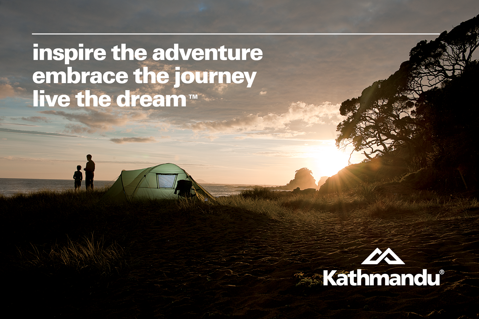
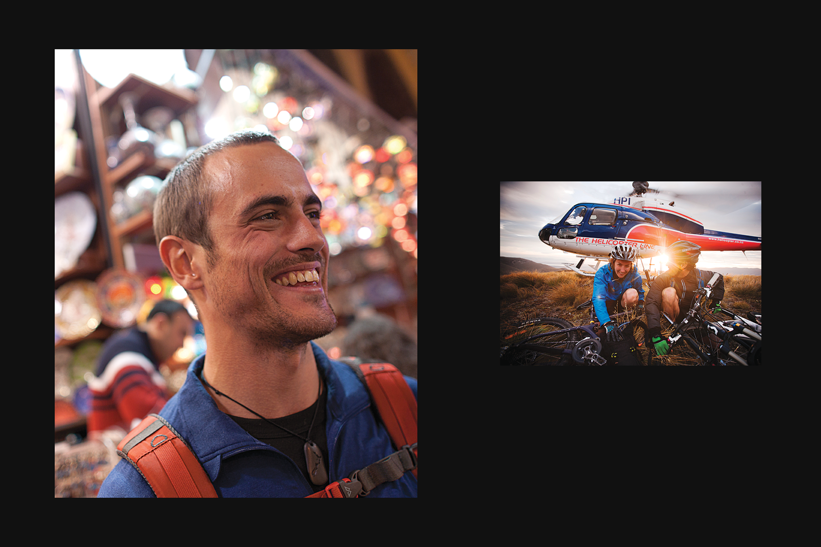
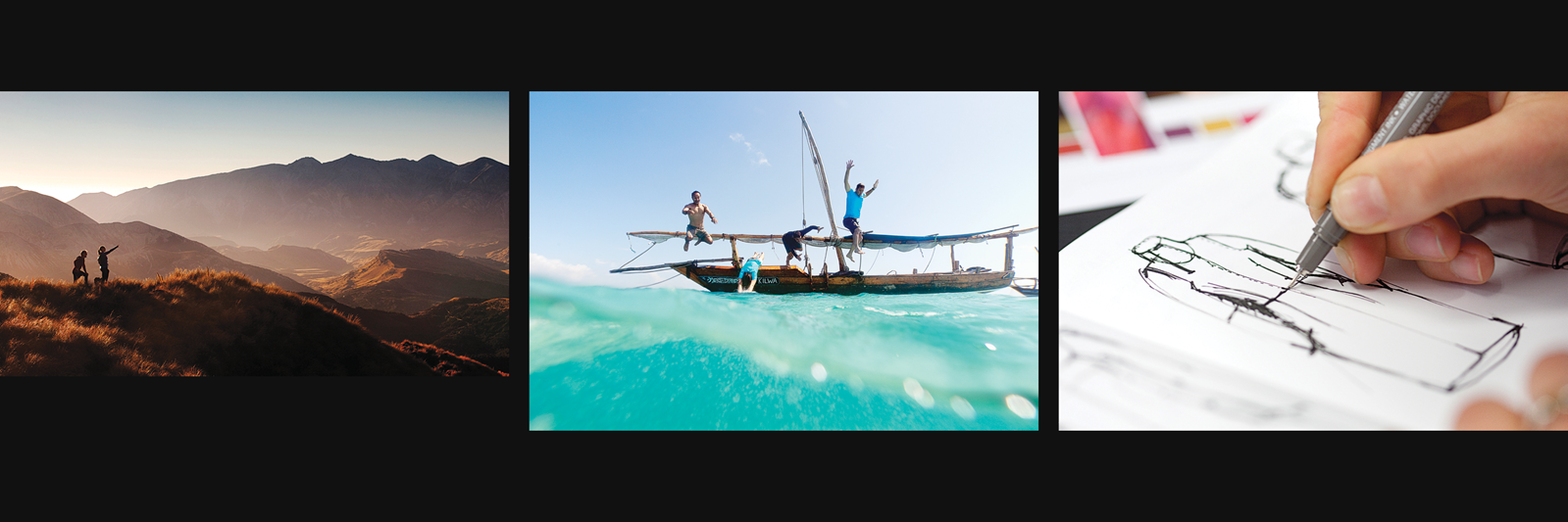
Our rebrand put Kathmandu’s belief in inspiring adventure front and centre. The philosophy grounds design decisions, binding together the people that make the products with the people that use them.
Brand development
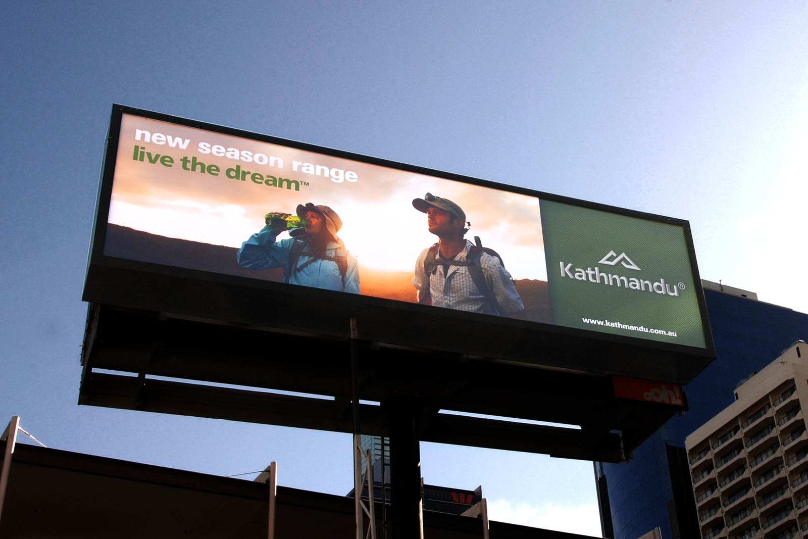
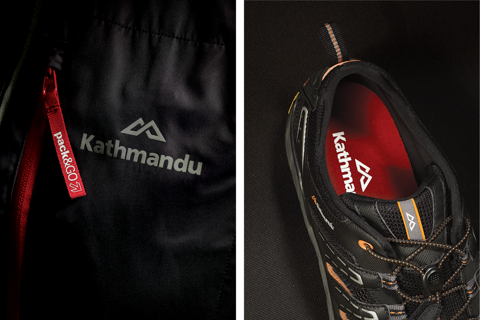
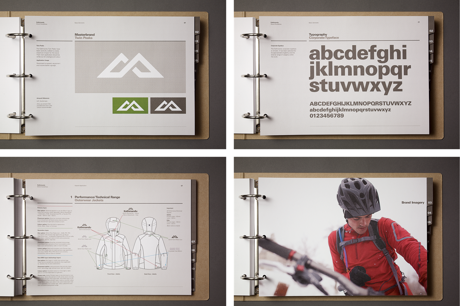
The face of the rebrand was the new logo we designed to stand the test of time. The ‘twin peaks’ mark was developed as a nod to the mountain range of the previous logo. It modernised the brand and translated better to products, giving Kathmandu greater design ownership of its clothing and equipment.
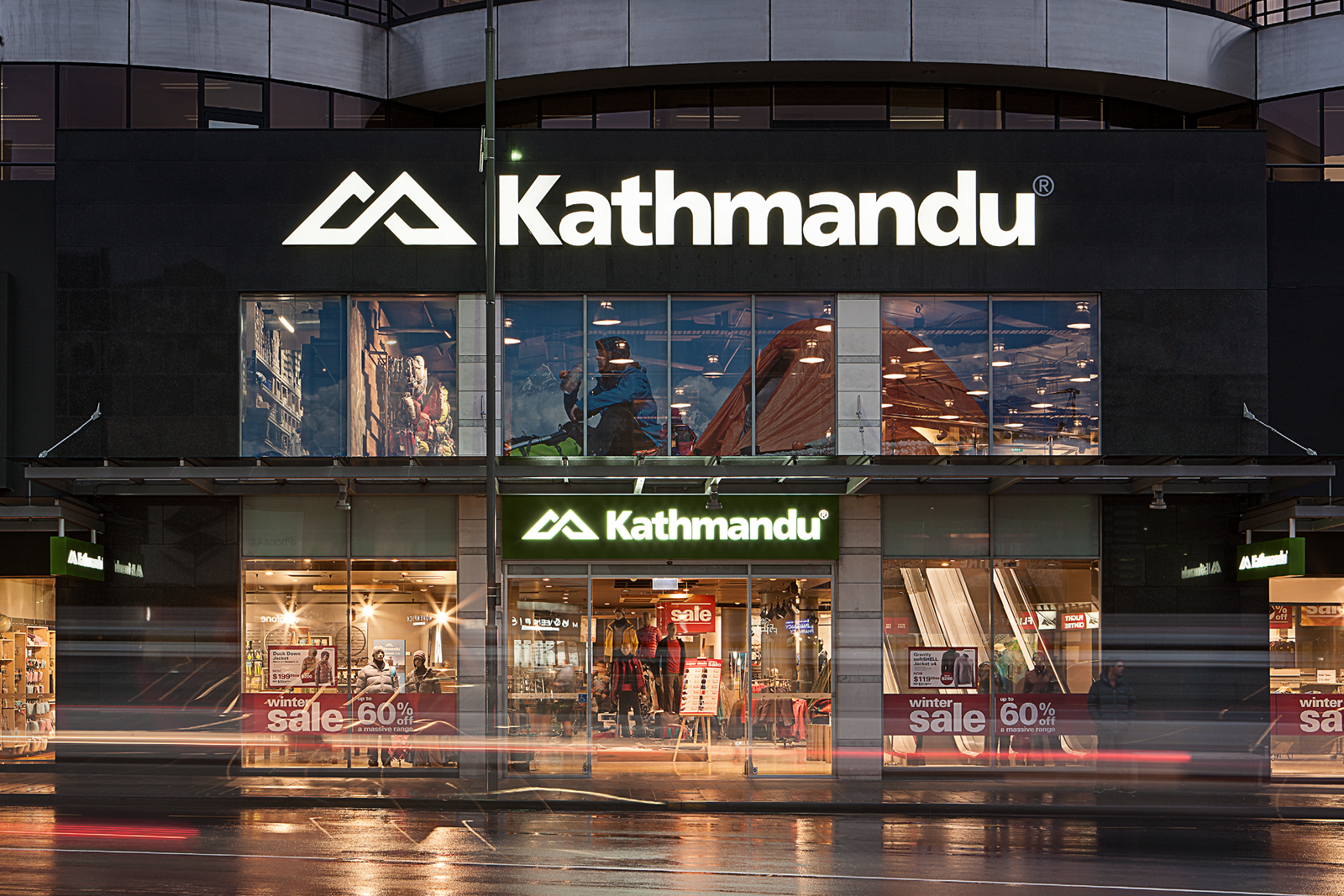
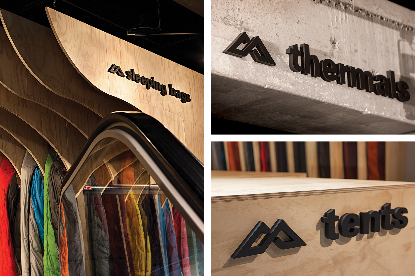
Environmental graphics
We ensured the rebrand gave Kathmandu’s retail spaces a stronger, sophisticated presence by creating a dynamic system that could be translated into varying store environments.

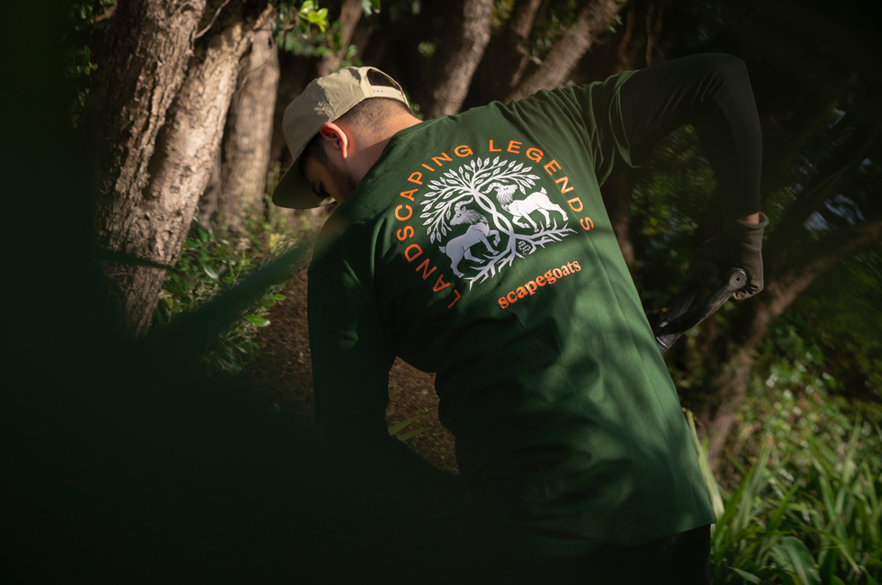
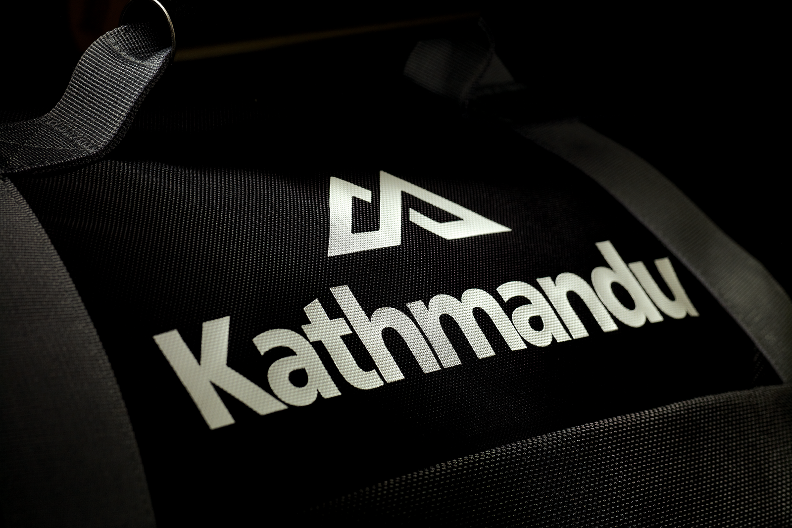
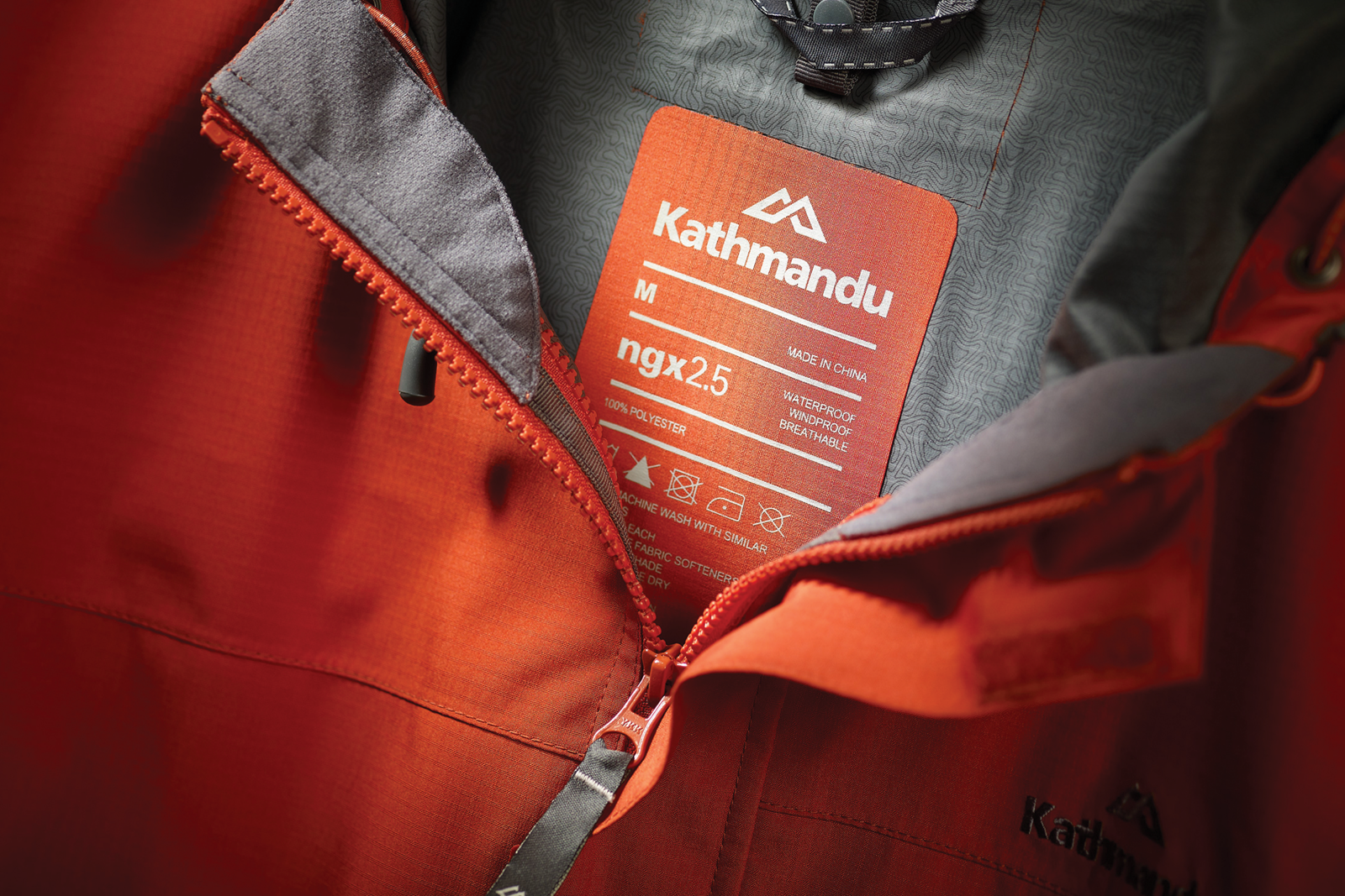
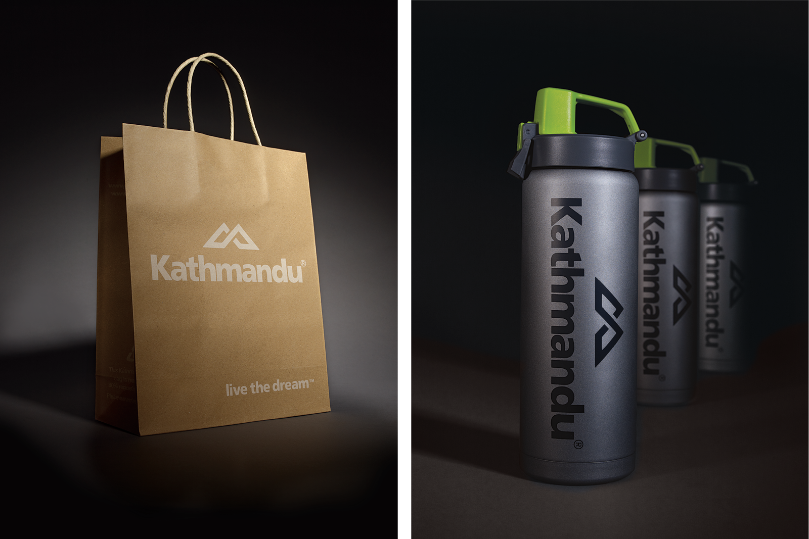
Branded gear and apparel
95% of the company’s sales are of Kathmandu-branded products, so we made sure to create an identity system that works across a range of applications from tees to tags.


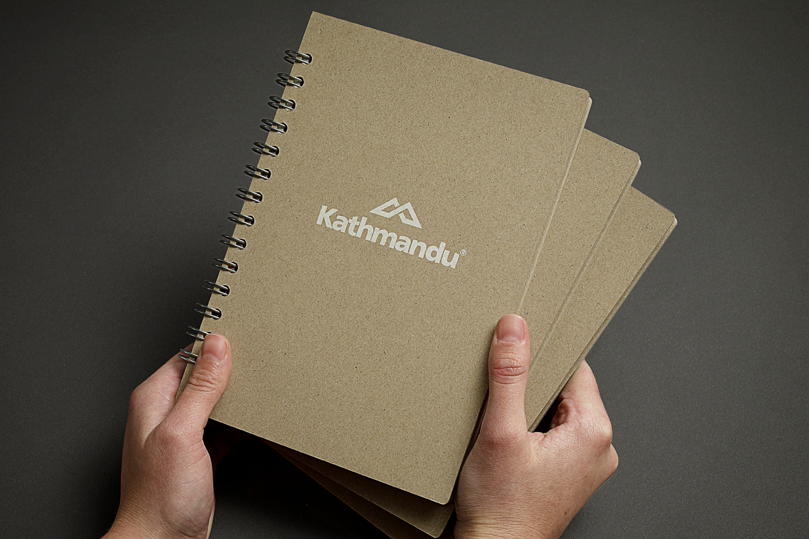
Brand packaging
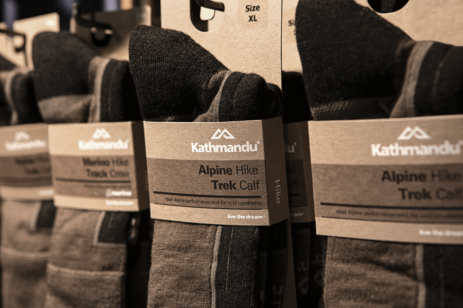
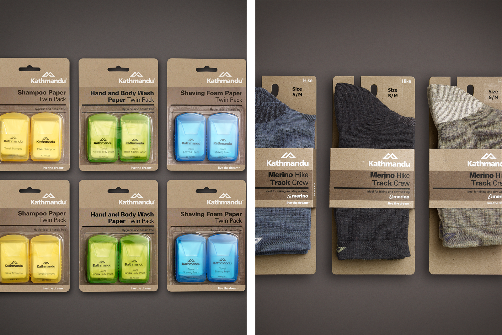
With over 3,000 products, it was vital to establish a consistent visual language for the packaging. We did this by simplifying the design, creating unity through bold typography printed on recycled card stock.
Internal engagement
To reach all staff – from management to the shop floor – we designed a Kathmandu ‘travel journal’ that shared the brand values and design philosophy.


The results
The impact of Kathmandu’s rebrand has been nothing short of transformational. The graphic language permeates every aspect of the brand, from advertising and signage to the smallest detail on the shop floor.