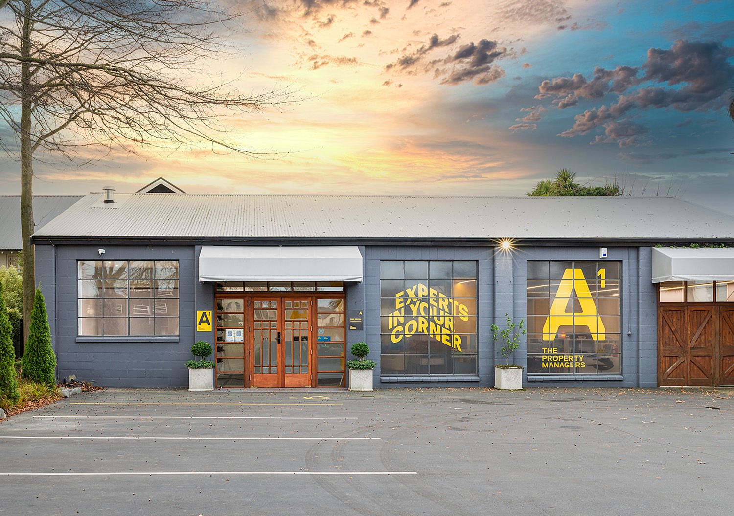
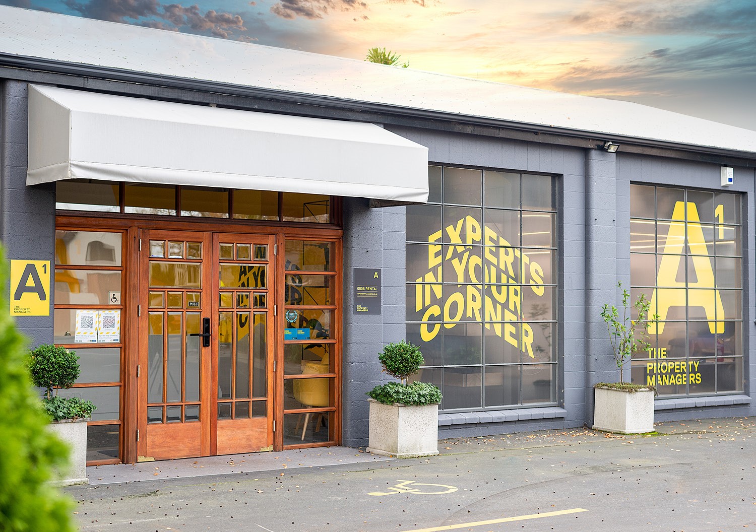
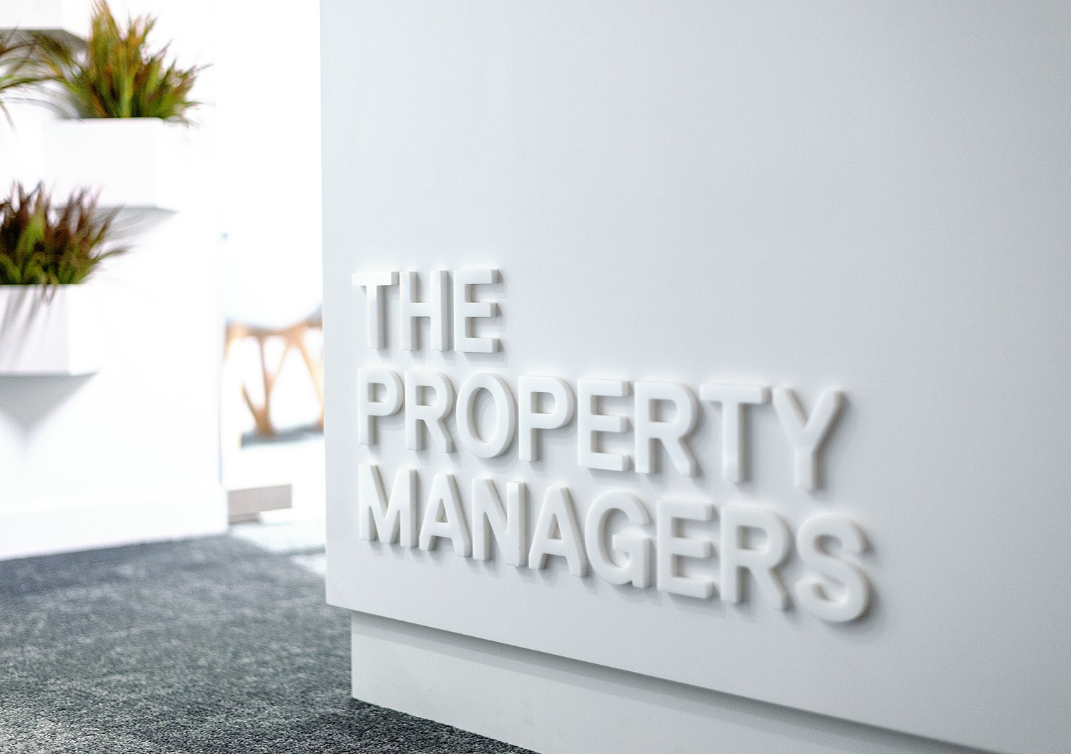
A1 Property Managers came to us with a challenge. They were moving premises to a renovated heritage building and wanted to take this opportunity to update their brand and bring it inline to match their positioning in the market. After 25 years in their profession, a new site in a prime location provided our client the opportunity to reinvent themselves for the future. Located on the corner of a busy intersection, there was scope to create a strong graphic presence with maximum visual impact.
A1 are the number 1 independent property managers in Christchurch for the last 25 years. We wanted to take this “insight” and celebrate it. We used this thought as the basis of the redeveloped brand.
Insights
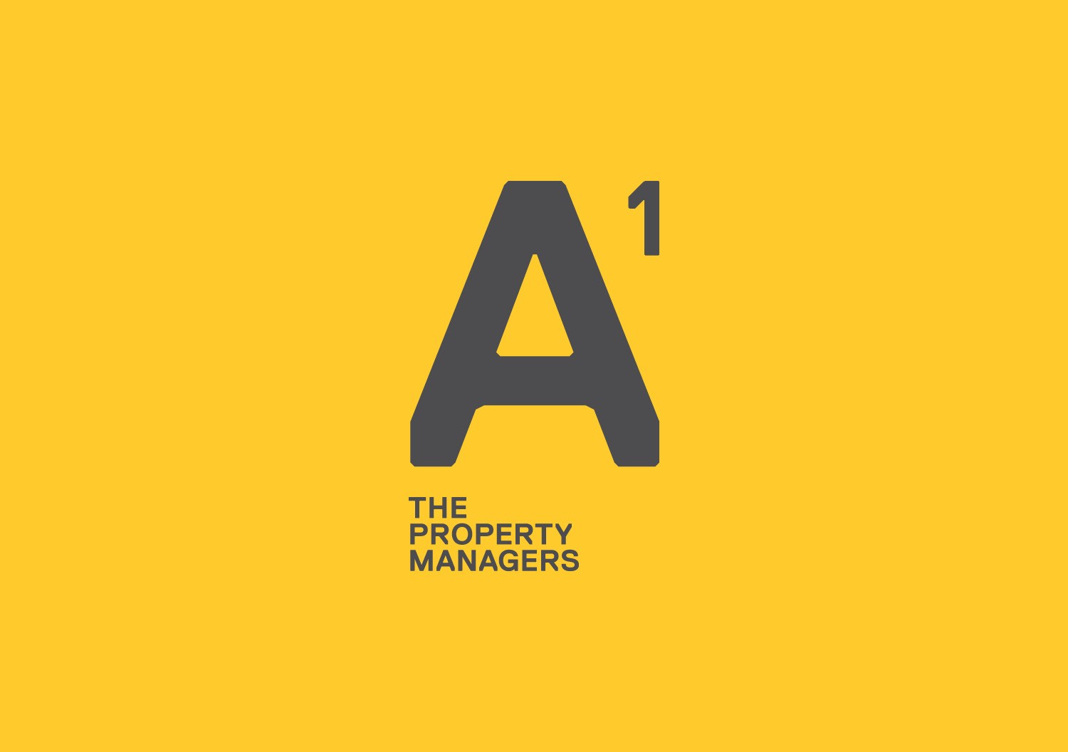
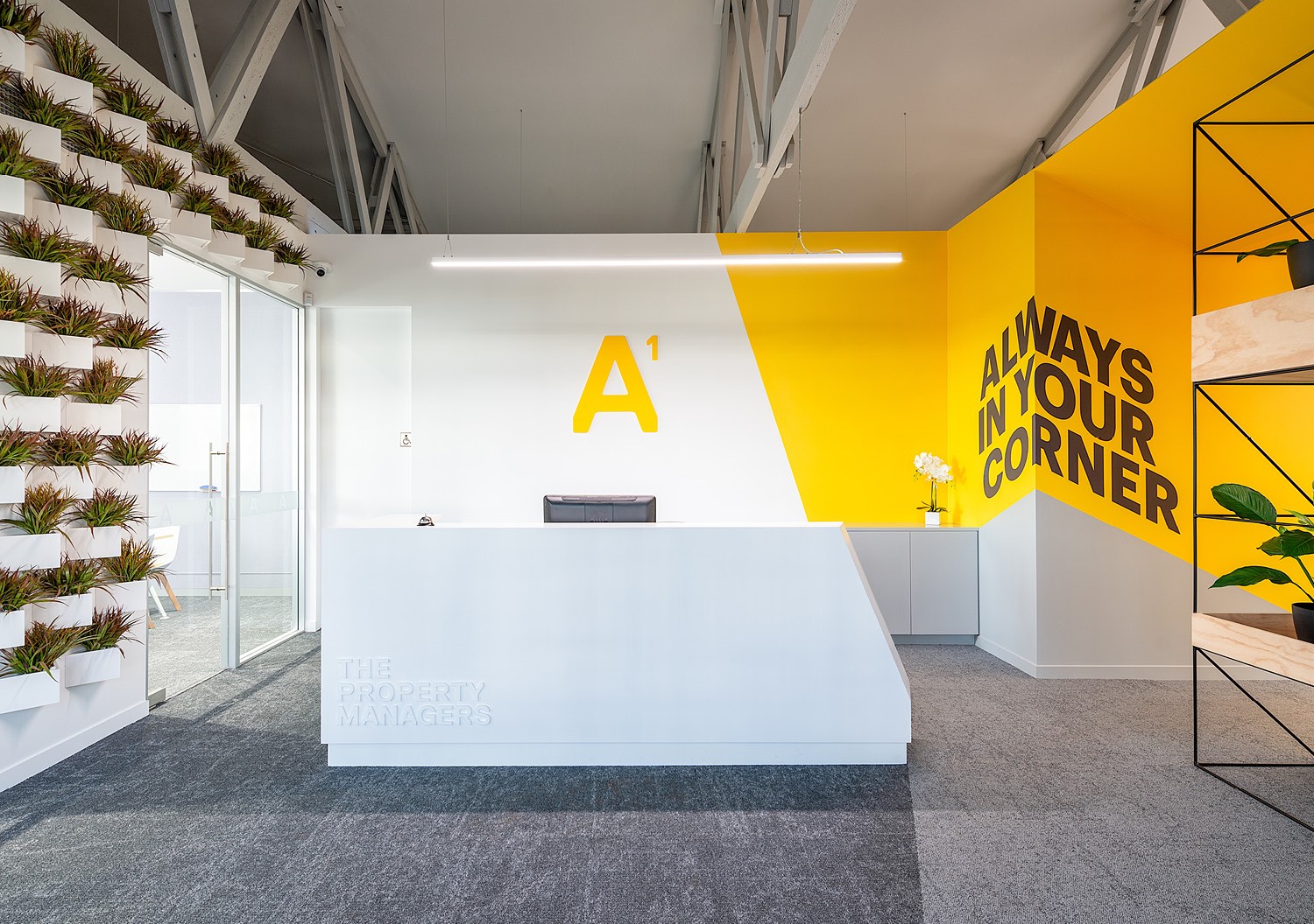
We came up with the idea of ‘To the power of 1’. This allowed us to make the '1' subscripted next to the ‘A’ which became a visual shorthand for being the best at what you do. The subscript ‘1’ also implies ownership or guardianship of the properties that they managed. We added the word 'the' in the front of ‘Property Managers'. This adds professionalism and helps them to refer to themselves as the authority on Property Management.
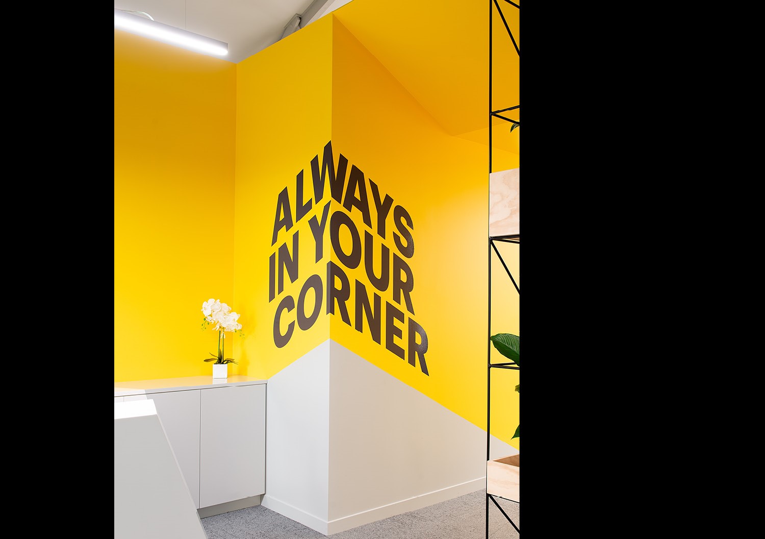
We then strengthen their existing positioning — which was “Experts in your corner” by adding to it with “Always in your corner”. Playing on the idea that A1 Property Managers are always in your corner / that you have experts in your corner. We use the typography and structure of those lines of words to make the 'corner' shape. This plays up their positioning line and also references the angular structure of the homes they manage.
Execution
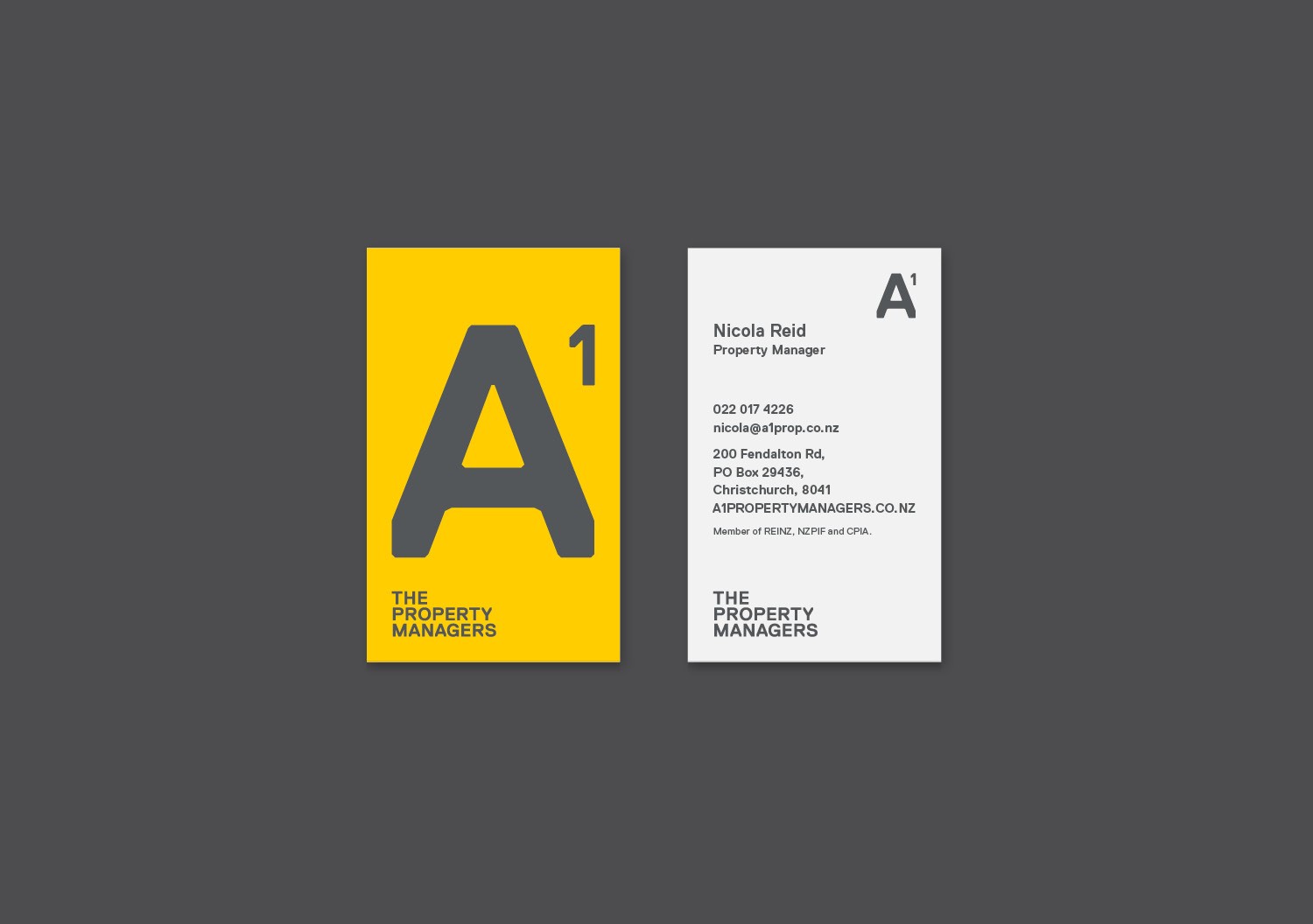
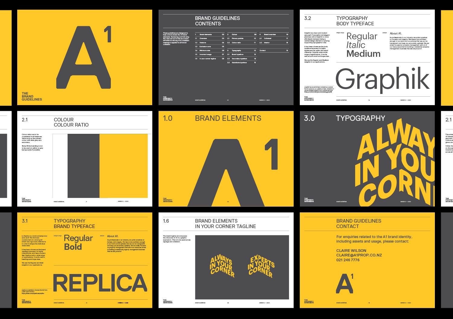
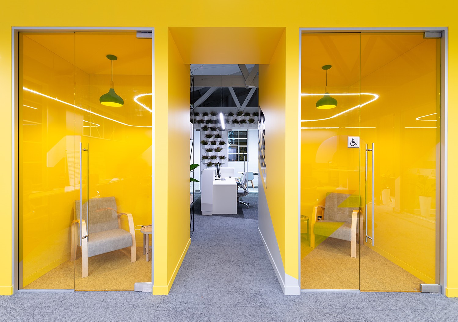
The primary branding colours - slate grey, yellow and white were chosen to give the brand and built environment a modern feel and a strong, confident identity.
These lines have then been woven into the new premises by literally putting it on the corners of the interior walls. We have also used the angles to great effect throughout the renovated building with the angles and the restricted colour palette (yellow and slate grey) helps to give a contemporary feel to the building and the refreshed brand that occupies it. The interior is enhanced by graphic elements that add visual interest to the space. The angular forms of the brand are evident within reception where they create a clever visual connection between the various spaces.
Here the visual brand enhances the space and the space compliments the brand. Together the two elements weave together to tell the brand story.
Interior Architects Hierarchy Group