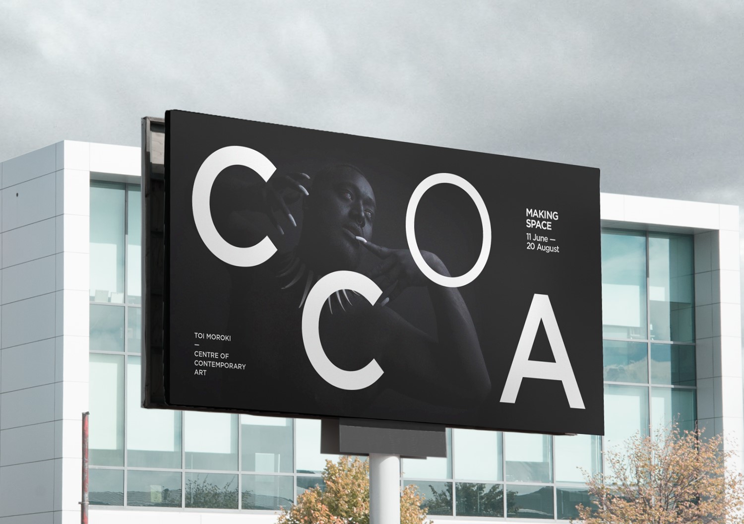
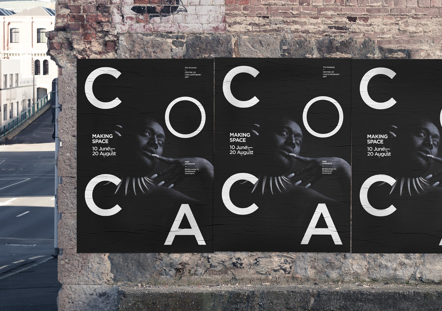
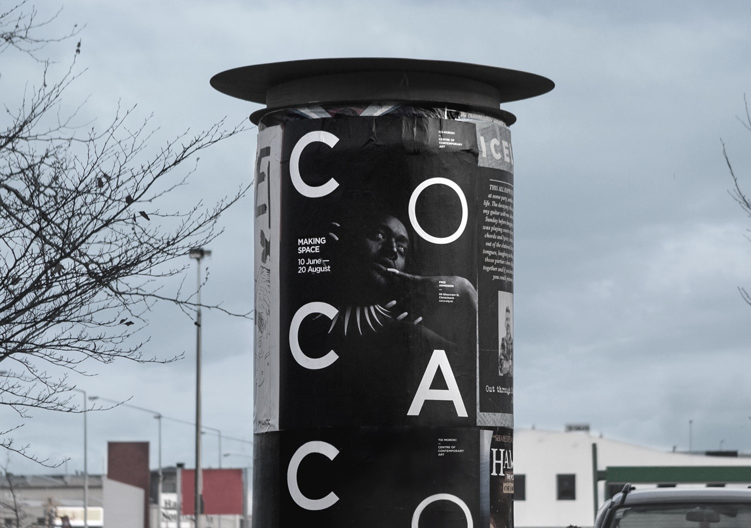
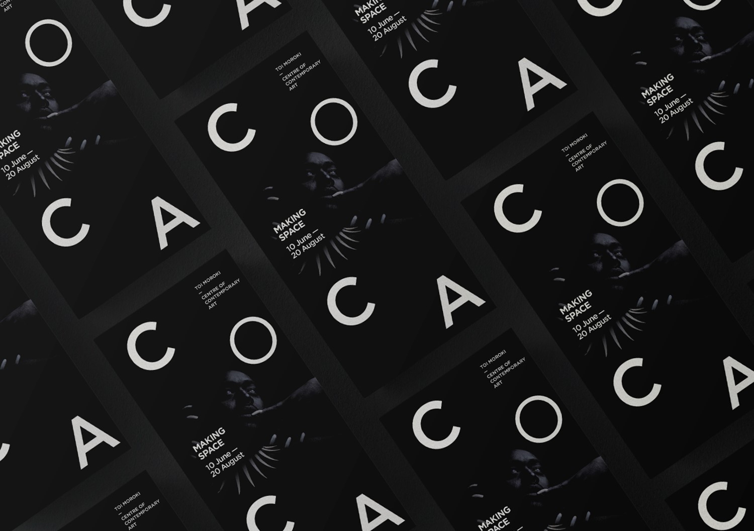
As the Creative Partner for CoCA, we take our role of presenting it to the Christchurch public very seriously. For the Making Space exhibition, we wanted to put CoCA front and centre of all our collateral and play with the gallery’s simple name in visually interesting ways through pattern and repetition.
Making Space was so-called because the six art collectives involved would be creating art in situ during the exhibition and this presented a logistical problem for us in that we had no imagery of the artwork available to us. To overcome this, we chose to use a striking image of one of the artists involved. Only his face and arms were well-lit in the intentionally under-exposed image to draw the viewer to his eyes and face.
In executing our concept, we designed billboards, brochures, and posters that worked separately but also as a set. This approach allowed us to create visually-pleasing patterns with the non-linear approach to type placement. The displacement of the letters on the posters and brochures created a playful variety of ways in which to read “CoCA.” This ambiguity and the discovery of the man’s face on closer inspection invited viewers to engage with the posters. This ensured cut through in a noisy outdoor advertising space.